Unit 7 · 19 min read
Website Page Layout and Design Issues
What the syllabus asks for 9
- Planning a website
- Layout types and page patterns
- Navigation
- Typography, colour and contrast
- Accessibility
- Performance
- SEO and browser compatibility
- Security and publishing
- Seeing design issues: access, contrast, weight and structure
A site can be technically correct and still fail: people cannot find things, the text is unreadable, it is slow on a phone, or it is unusable with a screen reader. This unit covers the design decisions around layout, usability, accessibility and publishing.
- Planning: audience, site map, wireframes; layout types and common page patterns.
- Navigation, typography, colour and contrast (with a computed WCAG check).
- Responsiveness, accessibility, performance, SEO, browser compatibility.
- Security basics and a publishing checklist.
7.1 Planning a website
- Purpose and audience: who visits and what do they need to do (apply, read results, buy)?
- Content inventory and site map: a tree of pages; most information within three clicks.
- Wireframes: simple grey-box sketches of each page's layout before any colours or code.
- Visual design: grid, type, colour, imagery; a style guide keeps pages consistent.
- Build, test, publish, maintain.
7.2 Layout types and page patterns
| Layout | Description | Pros / cons |
|---|---|---|
| Fixed | set width in px (e.g. 960) | predictable; poor on phones; wasted space on wide screens |
| Fluid (liquid) | widths in % |
fills any screen; line lengths may become too long |
| Responsive | fluid grid + media queries (Unit 4) | one site for all devices; more design effort |
| Adaptive | several fixed layouts chosen by device width | tuned designs; more to maintain |
Common page anatomy: header (logo, nav), hero or intro, main content (one to three columns), sidebar, footer (contacts, legal, sitemap).
Patterns: F-shaped reading (people scan the top and left), the visual hierarchy (size, weight, colour and whitespace mark what is important), grid alignment, generous whitespace, and above the fold content that answers "what is this site?" without scrolling.
7.3 Navigation
- Keep the main menu consistent on every page; limit it to about 5–7 items.
- Show where you are (highlight the current item, breadcrumbs: Home › Courses › Web).
- Links must look like links and say what they lead to ("Download syllabus", not "click here").
- Provide search for large sites, a footer sitemap, and a helpful 404 page.
- On phones use a compact menu (hamburger) with large touch targets (at least about 44 × 44 px).
7.4 Typography, colour and contrast
- Body text 16 px or larger, line height about 1.5, line length 45–75 characters; limit to two font families; use real headings for hierarchy.
- Colour: a palette of a primary, an accent and neutrals; never use colour as the only signal (add icons or text for errors).
- WCAG contrast: relative luminance of an sRGB colour is L = 0.2126 R + 0.7152 G + 0.0722 B with each channel linearised (c/255 ≤ 0.03928 → c/12.92, else ((c/255 + 0.055)/1.055)^2.4). Contrast ratio = \dfrac{L₁ + 0.05}{L₂ + 0.05} with L₁ the lighter. AA requires 4.5 : 1 for normal text and 3 : 1 for large text; AAA requires 7 : 1.
const lin = c => { c /= 255; return c <= 0.03928 ? c / 12.92 : Math.pow((c + 0.055) / 1.055, 2.4); };
const lum = hex => { const n = parseInt(hex.slice(1), 16); return 0.2126 * lin(n >> 16) + 0.7152 * lin((n >> 8) & 255) + 0.0722 * lin(n & 255); };
const ratio = (a, b) => { const [x, y] = [lum(a), lum(b)].sort((p, q) => q - p); return (x + 0.05) / (y + 0.05); };
for (const [fg, bg] of [["#000000", "#ffffff"], ["#1F4E8C", "#ffffff"], ["#777777", "#ffffff"], ["#999999", "#ffffff"], ["#ffffff", "#ffa500"]]) {
  const r = ratio(fg, bg);
  console.log(fg, "on", bg, r.toFixed(2) + ":1", r >= 7 ? "AAA" : r >= 4.5 ? "AA" : r >= 3 ? "large text only" : "FAIL");
}
#000000 on #ffffff 21.00:1 AAA
#1F4E8C on #ffffff 8.31:1 AAA
#777777 on #ffffff 4.48:1 large text only
#999999 on #ffffff 2.85:1 FAIL
#ffffff on #ffa500 1.97:1 FAIL
7.5 Accessibility
About 15% of people have a disability; accessibility also helps people on slow connections, in sunlight or with a broken mouse. The WCAG principles are POUR: Perceivable, Operable, Understandable, Robust. Practices:
- Meaningful
alttext; captions/transcripts for media; semantic HTML (Unit 2) and a logical heading order. - Everything usable by keyboard; visible focus outline; a "skip to content" link.
- Sufficient contrast; text resizable to 200% without breaking; do not rely on colour alone.
- Labels on every form control; clear error messages; ARIA attributes only when native HTML cannot express the role.
- Test with a screen reader (NVDA, TalkBack) and automated checkers (Lighthouse, axe).
7.6 Performance
Slower pages lose visitors (a delay of a few seconds loses many mobile users). Measures:
- Optimise images: right size, modern formats (WebP/AVIF),
loading="lazy". - Minify CSS and JavaScript and combine files; compress responses (gzip/Brotli).
- Cache static files (
Cache-Control) and use a CDN (copies near the user). - Put CSS in the head and load scripts with
defer; avoid heavy libraries and render-blocking resources. - Reduce HTTP requests; use fast hosting; measure with Lighthouse and the Network tab.
A page has 10 photos of 2 MB each = 20 MB. On a 4 Mbps (0.5 MB/s) connection that is 40 s of download. Resizing to display size and using WebP at about 100 KB each gives 1 MB: 2 s, a 20× improvement from one change.
7.7 SEO and browser compatibility
Search engine optimisation: unique <title> (about 60 characters) and <meta name="description">; one <h1>; semantic headings; descriptive URLs and link text; alt on images; a sitemap.xml and robots.txt; fast, mobile-friendly, HTTPS pages; useful original content and incoming links.
Compatibility: test in several browsers and devices; use standards, feature detection and progressive enhancement (basic content works everywhere, extras are added where supported); use a CSS reset or normalisation; check support tables such as caniuse.com before using new features.
7.8 Security and publishing
- Use HTTPS everywhere. Validate and escape all user input; never insert untrusted text with
innerHTML(cross-site scripting, XSS); use parameterised queries (SQL injection); setHttpOnly/Securecookies; keep software updated; hash passwords; never expose secrets in client code. - Publishing checklist: run an HTML/CSS validator; test links, forms and every page on phone and desktop; check contrast and keyboard use; set title, description and favicon; compress images; add analytics and a privacy notice; register the domain, upload to hosting, enable HTTPS; back up; plan maintenance.
7.9 Seeing design issues: access, contrast, weight and structure
Website design is about people, not just pixels.
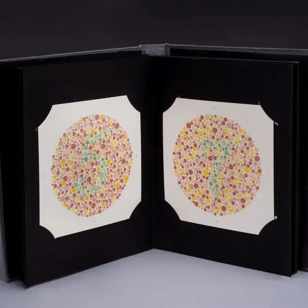
The plate shows three realities designers must respect: people who read the Web by touch, people who see colour differently, and the founder of the Web, who made universality its first principle.
The figures give numbers to the main issues: layout types, colour contrast, page weight, site structure, the search-result snippet and the four principles of accessibility.




7.9.1 Eight rules for a usable, accessible and fast website
- Plan for the visitor first. Write down who will use the site, what they want to do and on which devices. A college site mainly serves students on phones who want notices, results and admission details. Putting those three tasks on the first screen is better than a large photograph of the building.
- Keep the navigation simple. Use clear labels, a consistent menu on every page, a breadcrumb trail and no more than seven top-level items. A visitor should reach any page in three clicks. A confusing menu on a government service site means a citizen gives up and visits the office.
- Make the text readable. Use at least 16 px body text, line lengths of 45 to 75 characters, generous line spacing and a clear heading hierarchy. Nepali text in Devanagari needs a font that supports it and a little extra line height. Readable text keeps people on the page longer.
- Check colour contrast and never use colour alone. Aim for 4.5 to 1 for normal text and add an icon or label next to any red or green status. About one man in twelve cannot tell some reds and greens apart. A result page that says Pass or Fail in words as well as colour works for everyone.
- Build in accessibility from the start. Use semantic HTML, alt text, labelled form fields, keyboard operation and captions for video. Screen-reader users, such as blind students using a braille display or NVDA, depend on this structure. Accessibility also helps people with a broken mouse or bright sunlight on the screen.
- Make the page light and fast. Compress images, minify CSS and JavaScript, enable caching and compression and load only what the page needs. In the example the weight fell from 1,360 KB to 635 KB and the load time from 2.72 s to 1.27 s. Many Nepali users pay for each megabyte, so a light page is also a kind page.
- Help search engines and test every browser. Give each page a unique title and description, use headings in order, add alt text and a sitemap, and test on Chrome, Firefox, Safari and a phone. Use standard HTML and CSS so that the page degrades gracefully. A page that is easy for a search engine to read is usually easy for a person too.
- Secure it and publish carefully. Use HTTPS, validate on the server, keep software updated, back up regularly and never place passwords in the page code. Test links and forms before launch and again after every change. A hacked college site that shows a wrong result harms trust for years.
Formula and fact sheet
- Layout types: fixed, fluid, responsive, adaptive.
- Contrast ratio = \dfrac{L₁ + 0.05}{L₂ + 0.05}; AA 4.5:1 (3:1 large), AAA 7:1.
- POUR: Perceivable, Operable, Understandable, Robust.
- Speed: optimise images, minify, compress, cache, CDN,
defer. - SEO: title, description, h1, alt, sitemap, mobile, HTTPS.
Chapter summary
- Good sites start with purpose, audience, site map and wireframes.
- Layout, navigation, typography and colour must support reading and finding things; contrast can be measured.
- Accessibility, performance, SEO and compatibility are design requirements, not extras.
- Security basics and a final checklist precede publishing.
Practice
- Differentiate fixed, fluid and responsive layouts.
- List five navigation guidelines.
- Compute whether #777777 text on white meets WCAG AA (use the program's idea) and state the result.
- Explain the four WCAG principles.
- List six ways to speed up a web page.
- What is progressive enhancement?
- List five SEO practices.
- Name two common web security attacks and the defence for each.
Answers and worked solutions
1. Fixed: pixel width. Fluid: percentage widths. Responsive: fluid grid plus media queries that change the layout by screen width.
2. Consistent menu; limited items; show current location and breadcrumbs; descriptive link text; search/sitemap/404; large touch targets.
3. The program above gives 4.48:1 for #777777 on white, just below 4.5, so it fails AA for normal text (passes for large text); #999999 gives about 2.85:1 and fails.
4. Perceivable (see or hear it), Operable (use it with keyboard, enough time), Understandable (clear, predictable), Robust (works with assistive technology and many browsers).
5. Compress and resize images; minify CSS/JS; enable gzip/Brotli; cache static files; use a CDN; defer scripts; reduce requests.
6. Build a basic version that works everywhere, then add enhancements for browsers that support them.
7. Unique title and description, one h1, alt text, sitemap and robots.txt, fast mobile-friendly HTTPS pages, quality content.
8. XSS: escape output and avoid innerHTML with untrusted text. SQL injection: parameterised queries.
Model answers: medium (5 marks) and long (10 marks) questions
Q1 (5 marks). What is web accessibility? Explain four guidelines that make a website accessible to disabled users.
Introduction. Web accessibility means designing and coding websites so that people with visual, hearing, motor or cognitive disabilities can perceive, operate and understand them (section 7.5, Figure 7.6 and Plate 7.1).
- Text alternatives. Every informative image has alt text, and decorative images have an empty alt. A screen reader or braille display reads this text to a blind user.
- Keyboard operation. All links, menus and forms work without a mouse, in a logical tab order, with a visible focus outline.
- Contrast and colour. Text has at least 4.5 to 1 contrast and information is not conveyed by colour alone, because some users cannot distinguish red and green.
- Structure and labels. Use headings in order, landmarks (header, nav, main), labels linked to form fields and captions or transcripts for audio and video.
- Framework. WCAG groups these under four principles, Perceivable, Operable, Understandable and Robust (POUR).
| Principle | Example technique |
|---|---|
| Perceivable | Alt text, captions, contrast |
| Operable | Keyboard access, focus outline |
| Understandable | Plain language, clear errors |
| Robust | Valid HTML, ARIA labels |
Conclusion. Accessible design is not an extra feature; it follows from semantic HTML and good design, and it improves the site for every visitor.
Q2 (5 marks). Explain any five techniques to improve the performance of a web page. Calculate the load time before and after optimisation for the given sizes.
Introduction. Slow pages lose visitors, and the cost is highest on mobile connections, so reducing the number and size of downloads is a core design task (section 7.6, Figure 7.3).
- Optimise images. Resize to the displayed size, use modern formats such as WebP or AVIF and lazy-load images below the first screen.
- Minify and compress. Remove spaces and comments from CSS and JavaScript and let the server send gzip or Brotli compressed files.
- Cache. Set Cache-Control headers so that repeat visitors reuse files, and use a CDN to serve files from a nearby place.
- Reduce requests. Combine small files, use SVG and CSS instead of images where possible, and load scripts with defer or async.
- Limit what loads. Remove unused libraries and fonts; load only the font weights that are used.
- Calculation. A 1,360 KB page at 4 Mbit/s needs 1,360 x 8 / 4,000 = 2.72 s. After optimisation to 635 KB it needs 635 x 8 / 4,000 = 1.27 s, a saving of 53 percent in size and 1.45 s in time.
Conclusion. Smaller files, fewer requests and caching together make pages load faster; images are usually the largest saving.
Q3 (10 marks). Discuss the design issues to consider when building a website: planning, layout, navigation, typography and colour, accessibility, performance, SEO and security. Illustrate with a college website.
Introduction. A website succeeds when visitors find what they need quickly, on any device, and trust it. This depends on planning and on a set of design issues that interact with each other.
A college website for BCA admissions serves as the running example (sections 7.1 to 7.8, Figures 7.1 to 7.6).
- Planning. Define the goal (admission enquiries), the audience (students and parents, mostly on phones), the content and a schedule. Draw a sitemap and wireframes before any code.
- Layout. Choose a responsive layout: a fluid grid with breakpoints, one column on phones and three on desktops, with a text column limited to 45 to 75 characters (Figure 7.1).
- Navigation. Use a short menu, a breadcrumb trail, a search box and the three-click rule so that Admission, Notices and Results are reachable at once (Figure 7.4).
- Typography and colour. Use at least 16 px text, two font families at most, a limited palette and a contrast of 4.5 to 1 or more; text in Devanagari needs a supporting font (Figure 7.2).
- Accessibility. Follow POUR: alt text, keyboard access, labels and captions; test with a screen reader (Figure 7.6).
- Performance. Set a page-weight budget (for example under 700 KB), optimise images, cache and compress; measure the load time (Figure 7.3).
- SEO and compatibility. Unique titles and descriptions, semantic headings, a sitemap, HTTPS and mobile friendliness; test on several browsers (Figure 7.5).
- Security and publishing. Use HTTPS, server-side validation, updates and backups; register a domain, choose hosting, point the DNS and test before launch.
| Issue | Main question | Example for the college |
|---|---|---|
| Planning | Who and why? | Students seeking admission |
| Layout | Which devices? | Responsive, phone first |
| Navigation | Can they find it? | Menu, breadcrumb, 3 clicks |
| Typography and colour | Can they read it? | 16 px text, 4.5 : 1 |
| Accessibility | Can everyone use it? | Alt text, keyboard access |
| Performance | Is it fast? | 635 KB, 1.27 s at 4 Mbit/s |
| SEO | Can they find us? | Unique title and description |
| Security | Is it safe? | HTTPS, validation, backups |
Conclusion. Good web design is a balance of planning, usability, accessibility, speed, visibility and security. Treating each of these from the beginning produces a site that serves all users and needs far less repair later.