Unit 3 · 6 teaching hours · 30 min read
User Interface Design
What the syllabus asks for 7
- Graphical and web user interfaces
- Interaction styles
- Principles of UI design
- The UI design process
- Human considerations in interface and screen design
- Technological considerations in interface design
- Seeing the ideas: interaction styles, Fitts and Hick, touch targets, the process, breakpoints and response time
This unit moves from understanding users to designing what they will touch: graphical and web interfaces, the five interaction styles, the principles of UI design, the design process, and the human and technological factors that shape every screen.
- Graphical and web user interfaces and how they differ.
- Interaction styles: command line, menu selection, form fill-in, direct manipulation, anthropomorphic.
- Principles of UI design, including Fitts's and Hick's laws with worked numbers.
- The UI design process.
- Human considerations (perception, memory, attention, culture) and technological considerations (devices, platforms, performance).
3.1 Graphical and web user interfaces
A graphical user interface (GUI) presents information as visual objects the user manipulates with a pointing device or touch. The classic building blocks are summarised as WIMP: Windows, Icons, Menus, Pointer.
Advantages: visible options (recognition rather than recall), immediate feedback, learnable by exploration, consistent behaviour across applications.
Disadvantages: needs more screen, memory and processing; slower than commands for experts doing repetitive work; can bury options in menus.
A web user interface is a GUI delivered through a browser. Differences from desktop GUIs:
| Desktop GUI | Web UI |
|---|---|
| Installed; fixed window chrome | Runs in a browser; the browser's controls (back, refresh, URL) are part of the experience |
| Designer controls the window size | Unknown screen size, browser, speed — design must be responsive |
| Rich, instant interaction | Network latency; page loads; progressive loading needed |
| Own look and conventions per OS | Users bring expectations from other websites (logo top-left links home, cart top-right) |
| Menus along the top | Navigation is the central design problem (Unit 5): users arrive by search from any page |
| Single user session | Anyone, anywhere: first-time visitors dominate |
Web users scan, not read: they are goal-driven, impatient and leave in seconds. Hence short text, clear headings, strong visual hierarchy, and fast pages. Mobile apps add touch, small screens, sensors, notifications and intermittent networks.
3.2 Interaction styles
An interaction style is the way the user and the system exchange information.
| Style | How it works | Strengths | Weaknesses | Examples |
|---|---|---|---|---|
| Command line | the user types commands with arguments | very powerful, flexible, scriptable, low resource | must recall syntax; poor discoverability; error-prone | ls -l, git commit, SQL console |
| Menu selection | choose an item from a displayed list | no memorisation; limited choices reduce errors; self-explanatory | deep hierarchies are slow; experts feel hindered | ATM, restaurant app, phone IVR, Windows menu bar |
| Form fill-in | enter data into labelled fields | structured, guides the user, good for data entry | tedious if long; validation needed | sign-up, tax return, admission form |
| Direct manipulation | act on visible objects continuously with immediate visible results (drag, resize, pinch) | intuitive, reversible, immediate feedback, low errors; learning by doing | needs a good visual metaphor; hard to automate repetitive work | drag-and-drop files, map zoom, photo editor, sliding a slider |
| Anthropomorphic (natural-language or human-like) | the system converses in human-like language, voice or with a character | natural, no learning, engaging, accessible | ambiguity, over-trusting a "human-like" system, recognition errors, privacy | chatbots, voice assistants, avatars |
The five styles are mixed in practice: a modern app uses direct manipulation for the canvas, menus for commands, forms for settings and a command palette (Ctrl-K) for experts.
Shneiderman's direct-manipulation principles: continuous representation of objects, physical actions rather than complex syntax, rapid reversible incremental actions with immediate visible feedback.
3.3 Principles of UI design
Well-known sets: Shneiderman's Eight Golden Rules, Nielsen's 10 heuristics (Unit 7), and Norman's design principles. Core ideas:
Clarity and consistency
- Visibility of system status and feedback: every action gets a response (button state change, progress bar, toast message).
- Consistency: the same action looks and works the same everywhere — in terminology, colour, placement, behaviour; follow platform conventions.
- Affordance and signifiers (Norman): the design shows what can be done (a raised button, a text caret); a mapping matches controls to effects (a vertical slider moves things up and down); constraints prevent wrong actions (disable "Submit" until required fields are valid).
- Recognition over recall: show options rather than demand memory.
- Error prevention and graceful error recovery: confirmations for destructive actions, undo, forgiving formats, helpful messages ("The phone number must have 10 digits" rather than "Error 17").
- User control and freedom: cancel, back, undo.
- Minimalism / aesthetic design: every extra element competes with the relevant ones.
- Shortcuts for experts (accelerators), defaults for novices.
Laws of interaction (with numbers)
Fitts's law — the time to move to a target depends on its distance D and size W:
MT = a + b · log₂(D/W + 1), where a and b are constants measured for the device.
Take a = 0.1 s and b = 0.15 s/bit. A button 20 px wide that is 200 px away: log₂(200/20 + 1) = log₂ 11 = 3.46, so MT = 0.1 + 0.15 × 3.46 = 0.619 s. Make the button twice as wide (40 px): log₂ 6 = 2.58, MT = 0.488 s, a 21 % saving.
Moving the same 20 px button to 400 px away: log₂ 21 = 4.39, MT = 0.759 s. Since only the ratio D/W matters, a 20 px button at 100 px equals a 40 px button at 200 px.
Design consequences: make primary buttons big; put related controls close; screen edges and corners are infinitely deep targets (the cursor stops there) — so menu bars at the screen top are easy to hit; make touch targets at least 44 × 44 px (iOS) / 48 × 48 dp (Android).
Hick's law (Hick–Hyman) — decision time grows with the number of equally likely choices n: T = b · log₂(n + 1).
With b = 0.2 s: 3 choices → 0.2 × log₂ 4 = 0.4 s; 7 choices → 0.2 × log₂ 8 = 0.6 s; 15 choices → 0.2 × log₂ 16 = 0.8 s; 31 choices → 1.0 s. Doubling the options adds a constant increment (+b), not double the time.
Design consequences: group and categorise long lists, limit primary choices, use progressive disclosure, highlight a recommended option. (Note: this does not mean "never more than 7 items" — organise long lists sensibly.)
Miller's law — short-term memory holds about 7 ± 2 chunks: chunk phone numbers (98 4123 4567), group menu items. Jakob's law — users spend most of their time on other sites, so they prefer yours to work like those.
Law of proximity / similarity / common region (Gestalt, Unit 5). Doherty threshold — respond within ~400 ms or users lose focus; show progress for longer waits (<1 s no indicator, 1–10 s spinner, >10 s progress bar with estimate).
Tesler's law — complexity cannot be removed, only moved (to the system, not the user).
The Eight Golden Rules (Shneiderman)
- Strive for consistency. 2. Enable frequent users to use shortcuts. 3. Offer informative feedback. 4. Design dialogues to yield closure. 5. Offer simple error handling. 6. Permit easy reversal of actions. 7. Support internal locus of control. 8. Reduce short-term memory load.
3.4 The UI design process
- Understand users, tasks and context (Unit 2 research output: personas, journeys).
- Define requirements and task flows: user stories ("As a student I want to…"), use cases, task analysis (Unit 7).
- Structure: information architecture, sitemap, screen inventory, navigation model (Unit 5).
- Sketch and wireframe each screen, low fidelity (Unit 6).
- Design the visual layer: grid, colour, typography, components, states.
- Prototype (clickable) and test with users (Unit 7).
- Hand off to developers: specs, assets, design tokens, a component library.
- Implement, measure, iterate: analytics, feedback, A/B tests.
Related practices: atomic design (atoms → molecules → organisms → templates → pages), a design system (documented components, patterns, tokens, rules), and agile collaboration with developers.
3.5 Human considerations in interface and screen design
The designer must know the human being the screen is for.
| Factor | What the science says | Design response |
|---|---|---|
| Perception | the eye sees detail only at the fovea; we scan in F- or Z-patterns; colour vision deficiency affects about 1 in 12 men; contrast drops with age | clear hierarchy; don't rely on colour alone; adequate contrast and size |
| Attention | limited, easily distracted; "banner blindness" | one focus per screen; put key actions where users look |
| Memory | short-term memory is small (7 ± 2 chunks) and forgets fast; long-term improves with repetition and meaning | recognition over recall; chunk; show context and recent items |
| Learning | users form mental models from previous experience | match conventions; use familiar metaphors (folder, trash, cart) |
| Motor skill | pointing is limited by Fitts's law; thumbs reach the lower part of a phone screen | large targets; bottom navigation on mobile; spacing between tap targets |
| Individual differences | novice vs expert, age, language, literacy, disability, culture | accessibility, localisation, adjustable text size |
| Culture | reading direction, colour meanings (white = purity or mourning), date and number formats, icons and gestures differ | localise; test with local users; support Nepali (Devanagari) fonts, Nepali numerals and the Bikram Sambat calendar |
| Emotion | users are stressed, rushed, distracted | calm design, helpful tone, error messages without blame |
Screen-design guidelines that follow: group related items; align; leave white space; limit the number of fonts and colours; put the most important information at the top-left (for left-to-right scripts); use familiar words; keep sentences short; show only the necessary at each moment.
3.6 Technological considerations in interface design
| Factor | Considerations |
|---|---|
| Devices and input | mouse, keyboard, touch, stylus, voice, game controller; different precision → target sizes, hover vs tap (no hover on touch) |
| Screen | size, resolution, pixel density (@1x, @2x, @3x), aspect ratio, orientation, foldables; responsive layouts with breakpoints (typically ~600, ~900, ~1200 px) |
| Platform | Android (Material Design), iOS (Human Interface Guidelines), web, desktop — each has conventions; users expect them |
| Performance | loading time, image size, animation smoothness (60 frames per second = 16.7 ms per frame); target a first useful screen within about 2–3 seconds |
| Network | 2G/3G and unreliable links in rural Nepal → offline mode, small payloads, retry, optimistic UI |
| Accessibility technology | screen readers (TalkBack, VoiceOver, NVDA), switch control, magnifiers — design must expose proper labels and focus order |
| Browsers and compatibility | different rendering engines; test major browsers; progressive enhancement |
| Security and privacy | secure input masking, clear permission requests, safe defaults |
| Development constraints | what can be built in budget and time; reuse of components; design-to-code consistency |
Design for the worst plausible conditions: a cheap phone, a slow network, bright sunlight, one hand. If it works there, it works everywhere.
3.7 Seeing the ideas: interaction styles, Fitts and Hick, touch targets, the process, breakpoints and response time
User-interface design is about real devices and real people, so this section starts with photographs.
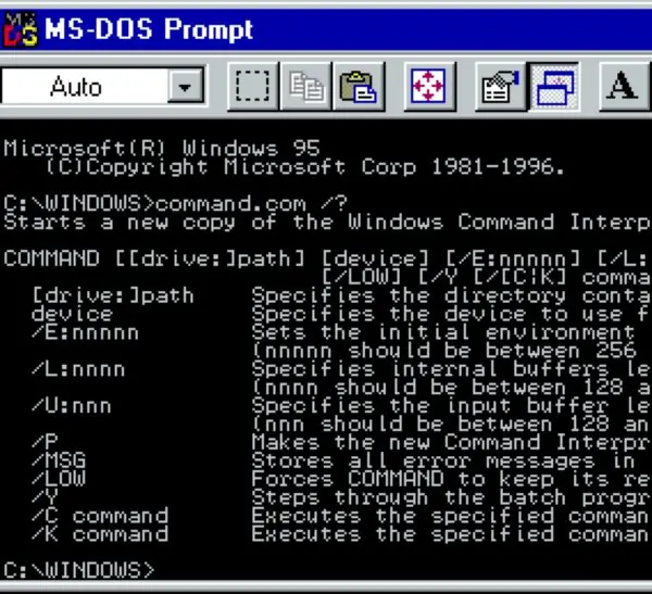
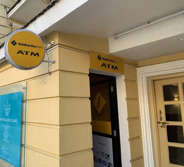
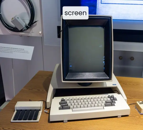
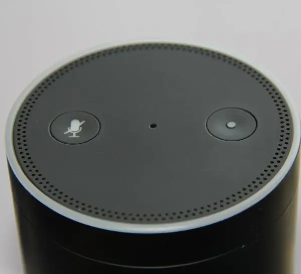
Plate 3.1 shows four interfaces that stand for four interaction styles, from a text terminal to a voice speaker, including the Xerox Alto, the machine that made windows and a mouse-driven pointer famous.
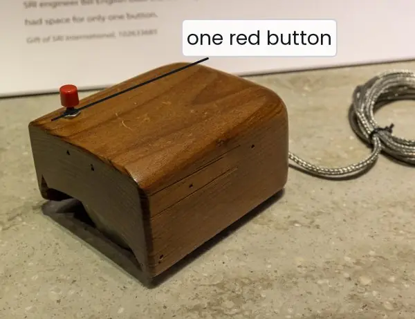
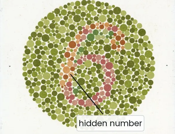
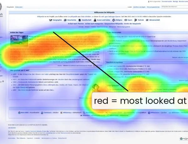
Plate 3.2 shows the mouse, a colour-vision test chart and an eye-tracking map: the human side of the screen.
The figures then compute Fitts's and Hick's laws, draw touch targets to size, compare the five styles on one task, and show the design process, responsive breakpoints and the response-time ladder.


3.7.1 Eight guidelines for designing user interfaces in Nepal
- Show the system status. After every tap the screen must answer: a pressed state, a spinner or a message. When a Fonepay or ConnectIPS payment is processing, say so and say how long it may take. Without feedback people tap twice and pay twice.
- Be consistent. The same action must look and work the same everywhere in the app. If "Pay" is a blue button on one screen, it must not be a green link on another. Consistency lets a user learn once and use everywhere, which matters for first-time users of the Nagarik App.
- Prefer recognition to recall. Show the options instead of asking people to remember them. A list of saved payees in eSewa or Khalti is faster and safer than typing a number. This follows Miller's law, because short-term memory holds only about seven items.
- Make targets big and close. Fitts's law (Fig. 3.1) says that large, near targets are fast to hit. Keep primary buttons at least 48 dp, put them in the thumb zone (Fig. 3.3) and never place Delete beside Save. Many Nepali users work one-handed on a bus or in sunlight.
- Limit the choices at one moment. Hick's law (Fig. 3.2) shows that time grows with every extra option. Group long lists, put the most common choice first and reveal advanced options only on request. A tax or exam-form portal should show one step at a time.
- Prevent errors and allow recovery. Disable the Submit button until the form is valid, ask for confirmation before a destructive action and offer undo. Write messages such as "The phone number must have 10 digits" instead of "Error 17". Users who can recover feel safe.
- Design for people and context. Use Nepali (Devanagari) text, Nepali numerals and the Bikram Sambat date when users expect them. Never use colour alone (Plate 3.2b), keep contrast high and respect the body of the reader: older eyes, small screens, bright light. Test with real users, not only with the team.
- Respect time, device and network. Respond within about 0.4 s and show progress for longer waits (Fig. 3.7). Use responsive breakpoints (Fig. 3.6), small images and offline-friendly screens, because a cheap phone on a weak 4G link is the normal case in many districts. If the design works there, it works everywhere.
Formula and fact sheet
- Fitts: MT = a + b · log₂(D/W + 1); bigger and closer is faster. Hick: T = b · log₂(n + 1).
- Interaction styles: command line, menu selection, form fill-in, direct manipulation, anthropomorphic.
- Touch target ≥ 44 × 44 px (iOS) / 48 × 48 dp (Android). Response under ~0.1 s feels instant, ~1 s keeps flow, ~10 s loses attention (Nielsen).
- Miller: 7 ± 2 chunks. Doherty: respond within about 400 ms.
- Golden rules: consistency, shortcuts, feedback, closure, error handling, easy reversal, user control, low memory load.
Chapter summary
- GUIs use windows, icons, menus and a pointer; web UIs add browser conventions, unknown screens and scanning behaviour.
- Five interaction styles each fit a task and user: command line, menus, forms, direct manipulation, anthropomorphic.
- UI principles stress consistency, feedback, affordance, error prevention and control; Fitts's and Hick's laws quantify pointing and choosing.
- The UI process runs from understanding and structure through wireframes, visual design, prototype, test and hand-off.
- Design must respect human limits (perception, memory, attention, motor skill, culture) and technical limits (devices, platforms, performance, network, accessibility technology).
Practice
- Differentiate between a GUI and a web UI.
- Compare the five interaction styles with one example each.
- State Fitts's law. For a = 0.1 s, b = 0.15 s/bit compute MT for D = 200 px with W = 20 px and with W = 40 px, and interpret.
- State Hick's law and compute T for 3, 7 and 15 choices when b = 0.2 s.
- List Shneiderman's eight golden rules.
- What is affordance? Give two examples of good and bad affordance.
- Describe the UI design process in steps.
- Explain four human factors that affect screen design and the design response.
- Explain four technological considerations in interface design with reference to Nepal.
- Why are screen edges easy targets? Why must touch targets be at least 44 px?
Answers and worked solutions
1. A GUI is a graphical interface of an installed application with controlled windows; a web UI runs in a browser, must be responsive across unknown screens, depends on the network and inherits browser conventions.
2. Table in 3.2: command line (git), menu selection (ATM), form fill-in (admission form), direct manipulation (drag-and-drop), anthropomorphic (chatbot).
3. MT = a + b log₂(D/W + 1): W = 20 → 0.1 + 0.15 × 3.46 = 0.619 s; W = 40 → 0.1 + 0.15 × 2.58 = 0.488 s. Doubling the target width saves about 21 % of the time.
4. T = b log₂(n + 1): n = 3 → 0.4 s; n = 7 → 0.6 s; n = 15 → 0.8 s.
5. Section 3.3 list.
6. Affordance = a perceived cue for how an object can be used. Good: a raised button, a text field with a caret. Bad: a flat label that is actually a link, a door with a handle that must be pushed.
7. Understand → requirements/task flows → structure/IA → sketch/wireframe → visual design → prototype and test → hand-off → measure and iterate.
8. E.g. perception (don't rely on colour alone), memory (recognition over recall), attention (one focus per screen), motor skill (large targets, bottom navigation), culture (localise, support Devanagari).
9. Low-end phones (performance and size), slow/unstable network (offline mode, small payloads), screen sizes (responsive), sunlight (high contrast), Android conventions (Material Design), Nepali fonts and calendar.
10. The pointer stops at the screen edge, so the target is effectively infinitely deep (W → ∞ in Fitts's law); fingertips are about 10 mm wide, and smaller targets cause mis-taps.
Model answers for Unit 3
Q1. Explain the five interaction styles with their strengths, weaknesses and examples. How would you choose between them? (10 marks)
Introduction. An interaction style is the way a user and a system exchange information.
Five styles are classical: command line, menu selection, form fill-in, direct manipulation and anthropomorphic (natural-language or human-like) interaction.
Plate 3.1 shows four of them on real devices, and Fig. 3.4 compares all five on one task, sending Rs 500 to Hari.
The five styles.
- Command line. The user types commands with arguments, such as
ls -lorgit commit. It is very powerful, scriptable and light on resources, but the user must recall the syntax and the style is hard to discover. - Menu selection. The user chooses an item from a displayed list, as on an ATM (Plate 3.1b). No memorisation is needed and the limited choices reduce errors, but deep menus are slow and experts feel held back.
- Form fill-in. The user enters data into labelled fields, as in a sign-up or admission form. It is structured and guides the user, but long forms are tedious and need validation.
- Direct manipulation. The user acts on visible objects with immediate, reversible results: dragging a file, pinching a map, sliding a slider. It is intuitive and low in errors, but needs a good visual metaphor and is poor for repetitive work.
- Anthropomorphic. The system talks in human-like language, by chat or voice (Plate 3.1d). It is natural and accessible, but suffers from ambiguity, recognition errors and privacy worries.
| Style | Learning effort | Speed for experts | Error risk | Example |
|---|---|---|---|---|
| Command line | high | very high | high | server shell |
| Menu selection | low | medium | low | ATM, IVR |
| Form fill-in | low | medium | medium | tax or exam form |
| Direct manipulation | low | high | low | map, photo editor |
| Anthropomorphic | very low | medium | medium | chatbot, voice assistant |
Choosing. Choose by user, task and context: experts doing repeated work want a CLI or shortcuts; first-time public users want menus and forms; hands-busy users want voice; visual tasks want direct manipulation.
Conclusion. No style wins everywhere. Good products mix them: direct manipulation for the canvas, menus for commands, forms for settings and a command palette for experts. The designer must test the mix with real users.
Q2. Differentiate between a desktop GUI and a web user interface. Why do web users scan instead of read? (5 marks)
A graphical user interface (GUI) shows information as visual objects that the user controls with a pointer or touch. Its building blocks are summarised as WIMP: windows, icons, menus and pointer. A web user interface is a GUI that is delivered through a browser.
| Point | Desktop GUI | Web UI |
|---|---|---|
| Delivery | installed on the computer | loaded in a browser |
| Window | designer controls size and chrome | unknown screen, browser and speed, so it must be responsive |
| Speed | instant response | network delay, page loads |
| Conventions | follow the operating system | follow other websites (logo top-left goes home) |
| Navigation | menus along the top | the central design problem; users arrive by search on any page |
| Users | known, trained | anyone, mostly first-time visitors |
Why users scan. Web users have a goal, little patience and many alternatives, so they leave within seconds. They look for headings, links and images that answer their question (Plate 3.2c shows the F-shaped path of the eye).
The design response is short text, clear headings, a strong visual hierarchy, a fast page and the main action placed at the top and left.
Example. A student who opens a result portal wants only a roll-number box and a View button; any extra banner is ignored.
Q3. Explain the principles of UI design. Include Norman's ideas, Shneiderman's eight golden rules and the laws of Fitts and Hick with worked numbers. (10 marks)
Introduction. Principles of UI design are tested rules that make interfaces clear, consistent and forgiving. The best-known sets are Shneiderman's Eight Golden Rules, Nielsen's ten heuristics (Unit 7) and Norman's design principles.
Core principles.
- Visibility and feedback. Every action gets a response: a button state, a progress bar or a message.
- Consistency. The same action looks and works the same everywhere.
- Affordance and signifiers (Norman). The design shows what can be done; a mapping links controls to effects; constraints prevent wrong actions, such as disabling Submit until the form is valid.
- Recognition over recall, and error prevention with recovery: confirm destructive actions, offer undo, write helpful messages.
- User control, shortcuts for experts and defaults for novices, and minimalism.
Shneiderman's eight golden rules: strive for consistency; enable shortcuts; offer informative feedback; design dialogues to yield closure; offer simple error handling; permit easy reversal; support an internal locus of control; reduce short-term memory load.
Fitts's law. MT = a + b log2(D/W + 1). With a = 0.1 s and b = 0.15 s per bit, a 20 px button at 200 px takes 0.619 s; a 40 px button at the same distance takes 0.488 s, which is 21 percent faster (Fig. 3.1).
Hick's law. T = b log2(n + 1). With b = 0.2 s, 7 choices take 0.6 s and 31 choices take 1.0 s (Fig. 3.2): doubling the options adds only a constant 0.2 s.
| Law | Says | Design response |
|---|---|---|
| Fitts | big and near is fast | large primary buttons, thumb zone |
| Hick | more choices, slower decision | group lists, highlight a default |
| Miller | memory holds 7 +/- 2 chunks | chunk numbers: 98 4123 4567 |
| Doherty | respond in about 0.4 s | spinner after 1 s, progress bar after 10 s |
Worked example. A bill-payment screen applies the principles together.
It shows a spinner and then a green success message (feedback), keeps the same blue Pay button on every screen (consistency), lists saved biller names (recognition), disables Pay until the amount is valid (constraint), asks "Pay Rs 1,250 to NEA?" before the final step (error prevention) and offers a clear Cancel (user control).
The Pay button is 48 dp high and sits in the thumb zone, so Fitts's law favours it.
Conclusion. The principles agree: show the user where they are, keep behaviour predictable, make the right action easy and the wrong action hard, and undo whatever goes wrong.
Q4. Using a = 0.1 s and b = 0.15 s/bit, find the Fitts movement time for a 40 px button at 600 px and for an 80 px button at 600 px. Using b = 0.2 s, find the Hick decision time for 10 and 63 choices. Comment on the results. (5 marks)
Fitts's law. MT = a + b log2(D/W + 1).
- For W = 40 px and D = 600 px: D/W + 1 = 16, log2 16 = 4.000, so MT = 0.1 + 0.15 x 4.000 = 0.700 s.
- For W = 80 px and D = 600 px: D/W + 1 = 8.5, log2 8.5 = 3.087, so MT = 0.1 + 0.15 x 3.087 = 0.563 s.
Doubling the width saves 0.137 s, about 20 percent.
Hick's law. T = b log2(n + 1).
- For n = 10: log2 11 = 3.459, so T = 0.2 x 3.459 = 0.692 s.
- For n = 63: log2 64 = 6.000, so T = 0.2 x 6.000 = 1.200 s.
The number of options grew more than six times, but the time grew less than twice.
Comment. A larger target is a cheap way to speed up a click, so primary buttons should be big.
Hick's law shows that the time to decide grows slowly with the number of choices, but real long lists are still hard because the eye must scan them. Designers should group, order and search long lists and highlight a recommended choice.
Q5. Describe the steps of the UI design process and the artefact produced at each step. (5 marks)
The UI design process (Fig. 3.5) turns research into a built and measured interface in eight steps.
- Understand users, tasks and context; the output is personas and journey maps (Unit 2).
- Define requirements and task flows as user stories and use cases, for example "As a student I want to pay the exam fee".
- Structure the product with information architecture, a sitemap and a navigation model (Unit 5).
- Sketch and wireframe each screen at low fidelity (Unit 6).
- Design the visual layer: grid, colour, typography, components and every state (empty, loading, error).
- Prototype and test: a clickable model is tried with real users (Unit 7).
- Hand off to developers with specifications, design tokens and a component library.
- Build, measure and iterate using analytics, feedback and A/B tests.
Related practices are atomic design (atoms, molecules, organisms, templates, pages), a design system of documented components and agile work with developers. The loop never ends: findings from steps 6 to 8 send the team back to earlier steps.
Example. For an exam-fee screen, the artefacts are Sita's persona, a user story, a three-screen sitemap, paper wireframes, a blue and white colour set, a Figma prototype tested with five students, a hand-off file and a conversion rate measured after launch.
Q6. Discuss the human considerations and the technological considerations in interface design. (10 marks)
Introduction. A screen is used by a human being on a real device. The designer must therefore consider both the human factors and the technological factors, and design for the worst plausible conditions: a cheap phone, a slow network, bright sunlight and one hand.
Human considerations.
- Perception. Detail is seen only at the centre of vision; users scan in F or Z patterns (Plate 3.2c). About 1 in 12 men have colour-vision deficiency (Plate 3.2b), so never rely on colour alone and keep contrast high.
- Attention. Attention is limited; use one focus per screen and put key actions where users look.
- Memory. Short-term memory holds about 7 +/- 2 chunks, so prefer recognition to recall and chunk long numbers.
- Learning and mental models. Match conventions and familiar metaphors such as folder, trash and cart.
- Motor skills. Pointing follows Fitts's law; use large targets and bottom navigation on phones (Fig. 3.3).
- Culture and emotion. Reading direction, colour meanings, date formats and gestures differ; support Devanagari, Nepali numerals and the Bikram Sambat calendar, and write calm, blame-free messages.
Technological considerations.
| Factor | Consideration |
|---|---|
| Devices and input | mouse, touch, stylus, voice; no hover on touch screens |
| Screen | size, pixel density, orientation; responsive breakpoints (Fig. 3.6) |
| Platform | Material Design on Android, Human Interface Guidelines on iOS, web conventions |
| Performance | first useful screen in 2 to 3 s; 16.7 ms per frame (Fig. 3.7) |
| Network | 2G and 3G in rural Nepal: offline mode, small payloads, retry |
| Accessibility technology | screen readers (TalkBack, NVDA), correct labels and focus order |
| Security and privacy | masked input, clear permission requests, safe defaults |
Worked example. A village health-post app is used by a nurse on a 3 GB phone, outdoors, over a weak signal.
The human factors give large Nepali text, high contrast that survives sunlight, big buttons for gloved or hurried hands and a calm tone for error messages.
The technology factors give an offline mode that saves records and syncs later, small images, a first screen in under three seconds and TalkBack labels for accessibility. Each decision traces back to a person or a device.
Conclusion. Human factors tell the designer what people can see, remember and reach; technological factors tell what the device and network can deliver. A design is good only when both agree.