Unit 4 · 12 teaching hours · 33 min read
UI Components
What the syllabus asks for 5
- Menus
- Windows
- Screen-based controls
- Graphics, icons and images
- Seeing the ideas: menus, windows, controls, icons and images
Interfaces are built from a small vocabulary of components: menus, windows and screen controls. This is the largest unit, because getting these basic parts right is most of everyday interface design.
We cover the menu system, window types and presentation, the full range of controls and how to choose the right control for a task, and how to design icons, graphics and images.
- System menus and their functions; formatting of menus (consistency, presentation, organisation, complexity, ordering, grouping).
- Types of menus: menu bar, pull-down, cascading, pop-up, tear-off, iconic.
- Windows: components, presentation styles (tiled, overlapping, cascading) and types (primary, secondary, dialog boxes).
- Screen-based controls: operable, text entry, selection, and other controls.
- Choosing the proper control for a task; icons, graphics and images.
4.1 Menus
A menu presents a list of options (commands, settings, destinations) from which the user chooses. It lets the user recognise rather than recall commands.
Functions of menus: navigation (move through the system), execution of commands, selection of options (toggle settings), and the display of available actions in context.
Formatting menus
| Aspect | Guidelines |
|---|---|
| Consistency | same wording, order, location, shortcuts and look in every menu and screen; platform conventions (File, Edit, View, … Help) |
| Display and presentation | show items clearly; use mixed-case text (easier to read than ALL CAPS); distinguish unavailable items by greying out (and keep them visible); indicate submenus with an arrow › and shortcuts with the key combination; show the current selection with a tick or highlight; allow keyboard access (underlined mnemonic letter, e.g. File = Alt-F) |
| Organisation | arrange by task, by function or by user workflow; follow users' mental model (card-sort to find it) |
| Complexity | prefer broad and shallow to narrow and deep: 4–8 items per menu, at most 2–3 levels; long hierarchies slow users and cause errors (Hick's law, and hierarchy costs navigation) |
| Item arrangement and ordering | order by convention (File, Edit, View…), frequency (most used at the top), importance, sequence (steps of a process), alphabetical (for long lists of names), or size/time; never random; put destructive items (Delete, Exit) away from frequent ones |
| Grouping | cluster related items with separator lines or spacing — 3–5 items per group; give groups a clear label; place related groups together |
| Naming | short, meaningful verbs or nouns; the same word for the same thing; the most important word first; no ambiguity (Save vs Save As) |
Types of menus
| Type | Description | Typical use | Notes |
|---|---|---|---|
| Menu bar | a horizontal strip of top-level titles at the top of the window or screen | the main command set of desktop applications | always visible; follows convention; the top edge is a Fitts's-law bonus |
| Pull-down (drop-down) menu | list that drops from a menu-bar title when clicked | commands of one category | closes after selection; supports keyboard mnemonics |
| Cascading (hierarchical) menu | a submenu opening to the side of an item with an arrow | sub-options (e.g. Open Recent ›) | needs steady pointer movement; limit to 2 levels; allow a short delay before closing |
| Pop-up (context) menu | appears at the pointer on right-click or long-press | actions for the selected object | context-specific, saves travel; not discoverable alone — duplicate important commands elsewhere |
| Tear-off menu | can be dragged off to become a floating window | frequently used palettes (tool options) | cuts repeated travel; rare today |
| Iconic menu | items are icons (toolbars, ribbon, dock, bottom tab bar) | frequently used actions; limited space | add tooltips and labels for unfamiliar icons |
Modern web and mobile patterns: hamburger menu (three stacked lines) hiding navigation (saves space but lowers discoverability — measured to reduce use of hidden items), tab bar (3–5 destinations always visible at the bottom on phones), navigation drawer, mega-menu (a large panel with grouped links on content-heavy sites), kebab/overflow menu (three vertical dots for extra actions) and breadcrumbs.
4.2 Windows
A window is a separate, bounded area of the screen showing one view of the system's content.
Components of a window
Title bar (name; drag handle; window buttons — minimise, maximise/restore, close), menu bar, toolbar, status bar (feedback), client (work) area, scroll bars, resize border/handle, window frame and often tabs.
Good window design uses a descriptive title, a consistent layout, visible controls and does not hide the close button.
Window presentation styles
| Style | Description | Pros | Cons |
|---|---|---|---|
| Tiled windows | windows are arranged side by side, edge to edge, with no overlap | every window is fully visible; no window management; no lost windows; uses the screen fully | each window is small; resizing one changes the others; not good for many windows |
| Overlapping windows | windows may lie on top of each other like papers on a desk (the usual desktop) | familiar desk metaphor; larger windows; flexible; depth shows focus | windows can hide each other; time spent arranging and finding; visual clutter |
| Cascading windows | a variant of overlapping where each new window is placed slightly down and right of the previous, so every title bar is visible | automatic placement; easy to pick a window by its title | top windows hide most of the others; stacks quickly clutter the screen |
Other: split panes (two resizable areas in one window), tabs (many views in one window — the web standard), virtual desktops/workspaces, full-screen and picture-in-picture.
Types of windows
| Type | Purpose | Behaviour |
|---|---|---|
| Primary window | the main window of an application; shows the main content and workspace; appears when launching the application | one per application (or document) with the full set of controls; closing it exits the application |
| Secondary window | supports the primary window: extra info, properties, tool palettes, help | dependent on the primary window; closes or minimises with it; may stay open |
| Dialog box | a short, focused exchange: asks for information, confirms an action or reports a message | usually small; may be modal or modeless |
Modal dialog blocks the parent until answered (use for decisions that must happen now: "Discard unsaved changes?"). Modeless dialog lets the user continue working (Find and Replace, palettes).
Types of dialog: message/alert, confirmation, input/property/settings, file open/save, wizards (step-by-step with Next/Back), tool dialogs.
Dialog design: clear title; plain language; one main question; clearly labelled buttons that name the action (Save / Don't save / Cancel, not OK/Cancel when ambiguous); the safe action is the default; the primary button on the right (Windows) or follows platform rule; Escape cancels; Enter confirms; never use modal dialogs for non-urgent information — use toasts/snackbars or inline messages.
On mobile: bottom sheets and alerts replace dialogs.
4.3 Screen-based controls
Controls (widgets) are the objects through which users give input and get output. Grouped by what the user does:
Operable controls (cause an action)
| Control | Use | Guidelines |
|---|---|---|
| Button (command/push button) | trigger an action | label with a verb ("Submit", "Pay now"); primary (filled), secondary (outlined), tertiary (text); show states: default, hover, pressed, focused, disabled, loading; min size 44 px; one primary per screen; do not hide with only an icon unless universally known |
| Default button | the action triggered by Enter | the safe/likely action |
| Toolbar | a row of icon buttons for frequent commands | group by function; tooltips; allow customisation; same order across screens |
| Link | navigate | underlined or distinct colour; descriptive text (not "click here"); visited state |
| Toggle / switch | immediate on/off setting | takes effect instantly (not requiring Save); label states clearly |
| Floating action button (FAB) | the single primary action of a mobile screen | one per screen; reachable by thumb |
| Spinner, progress bar | show status | determinate when the length is known |
Text entry and read-only controls
| Control | Use | Guidelines |
|---|---|---|
| Single-line text box | short free-text (name, email, search) | label above or beside (not only placeholder text — it vanishes and fails accessibility); size reflects expected length; use input types (email, tel, number) so mobile shows the right keyboard; show format hints; validate inline after leaving the field |
| Multi-line text box (text area) | long text (message, address) | resizable; character counter if limited |
| Password field | secret | mask with a "show password" toggle; allow paste for password managers |
| Combo box / autocomplete | type or pick | suggestions as the user types; good for long lists |
| Spin box (stepper) | numeric within a range | for small ranges; allow typing |
| Read-only controls (labels, display fields, text blocks) | show information | style differently from editable text; selectable to copy |
Selection controls
| Control | Selection | Use |
|---|---|---|
| Radio buttons | one from a small set (2–6) of mutually exclusive options, all visible | a choice that must be seen and compared (delivery speed); preselect a sensible default; vertical list |
| Check boxes | zero or more from a set; each independent | options and consent ("Remember me"); label states the "on" meaning; a single check box = a yes/no flag |
| List box | one or several from a visible list (5–8 items visible) | longer lists where items should remain visible; allow multi-select with Ctrl/Shift |
| Drop-down list (select) | one from a list that is hidden until opened | long lists (country, district) to save space; sort sensibly; avoid for fewer than ~4 options (use radio buttons) |
| Segmented control / toggle group | one of 2–5 related options | switch view (Day / Week / Month) |
| Chips/tags | multi-select or filters | filter bars |
Other controls
| Control | Use | Guidelines |
|---|---|---|
| Slider | choose a value in a continuous range where precision is not vital | show the value; min/max labels; large thumb; accompany with a number input if precision matters |
| Tabs | switch between related views of one object | few (≤ 7) tabs, labels short, current tab clearly marked; not for sequential steps |
| Date picker | choose a date | calendar for near dates; typing for far dates (date of birth); support the BS calendar for Nepal; show format |
| Time picker | choose a time | clock or spinner; 12/24-hour format |
| Scroll bar | move through content larger than the view | visible indication of position; keyboard support; avoid horizontal scroll |
| Accordion / expander | collapse and expand sections | progressive disclosure of details |
| Stepper/progress indicator | where the user is in a multi-step process | "Step 2 of 4" |
| Tooltip | short help on hover/focus | not for essential information (no hover on touch) |
| Carousel | rotating content | slow, users miss content; avoid for important content |
| Pagination / infinite scroll | split long lists | pagination for goal-directed finding; infinite scroll for browsing |
| Table / data grid | compare structured data | sortable headers, aligned numbers, zebra rows, sticky header |
| Snackbar/toast/banner | short non-blocking message | auto-dismiss only for non-critical messages |
Selecting the proper control
| Task | Best control |
|---|---|
| Choose exactly one of 2–6 options | radio buttons (or a toggle for on/off) |
| Choose exactly one from many (> 6) | drop-down list (or autocomplete for very long lists) |
| Choose any number of options | check boxes (list box with multi-select if long) |
| Turn a setting on/off immediately | switch |
| Agree to terms (a single yes/no on submit) | check box |
| Enter free short text | single-line text box |
| Enter long text | text area |
| Enter a number in a small range | spin box / slider (slider if approximate) |
| Enter a number precisely | text box with validation |
| Choose a date | date picker (typed field for birthdates) |
| Switch between views | tabs or segmented control |
| Trigger an action | button |
| Navigate | link or menu |
| Show status | progress bar / spinner / status text |
Principles: use standard controls in the usual way; label every control clearly; group related controls (fieldsets, panels) with headings; align labels and fields; tab order follows the visual order; give feedback after use; show disabled states; validate input and describe errors beside the field with a fix; keep forms short, single-column, and mark optional rather than required fields where possible.
4.4 Graphics, icons and images
Meaningful graphics
Graphics must communicate, not decorate.
Use pictures where they speed understanding (maps, charts, product photos), keep them consistent in style, ensure legibility at the displayed size, provide text alternatives (alt text) and avoid cultural misunderstandings.
Remove chartjunk; label axes; choose the right chart (line for trends, bar for comparison, pie for a few parts of a whole).
Icons
An icon is a small pictorial symbol representing an object or action.
Types (by Rogers): resemblance (looks like it: a printer), exemplar (typical example: a knife and fork for a restaurant), symbolic (a higher-level concept: a cracked glass for fragile), arbitrary (learned association: the radiation sign). Guidelines:
- Familiar and distinguishable: use standard icons (magnifier = search, trash = delete, gear = settings, envelope = mail).
- Simple: recognisable at 16–24 px; avoid fine detail; consistent stroke width, corner radius, style (outlined or filled, not mixed) and grid (e.g. 24 × 24 with 2 px padding).
- Label them (text with icon) whenever the meaning is not universal — icon-only buttons with ambiguous symbols (e.g. a "heart" vs "star") mislead.
- Test them with users (recognition test).
- Avoid culturally specific gestures, mailbox shapes (US mailbox for e-mail), or old technology (floppy disk for save is now a learned convention).
- Provide accessible names (aria-label) and adequate contrast and size; use vector formats (SVG).
- Favicons and app icons: simple, distinctive, readable at 16 px and 1024 px; follow platform shape guidelines.
Images
Choose real, relevant, high-quality images; avoid generic stock photos that mean nothing.
Technical rules: use WebP/AVIF/JPEG for photos, PNG/SVG for graphics; compress; use responsive images (several sizes); lazy-load; set width and height to prevent layout shift; give alt text; keep text outside images (so it can be read by screen readers and translated).
Ensure that overlaid text keeps sufficient contrast with a scrim. Respect copyright and use properly licensed assets. Photos of people should be diverse and local when the audience is local.
4.5 Seeing the ideas: menus, windows, controls, icons and images
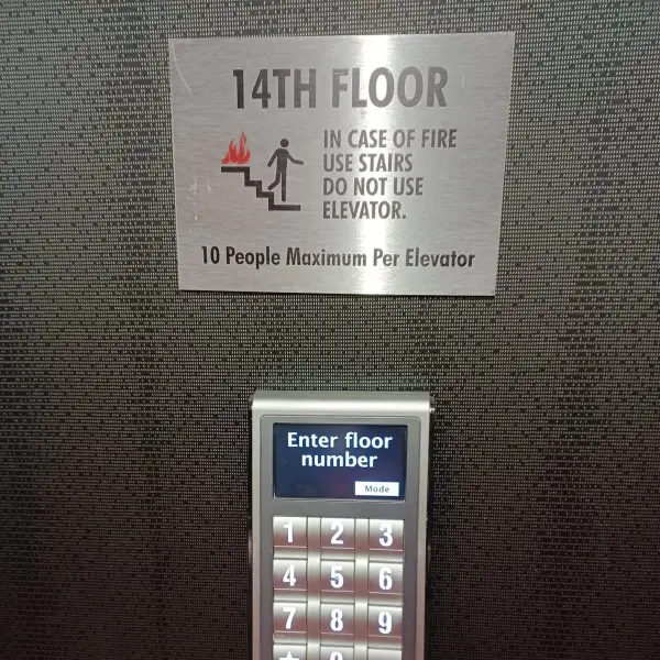
Every screen component began as a real object or a real habit. Plate 4.1 shows four physical controls that became on-screen controls: the toggle switch, the slider, the push-button keypad with its display and the dial.
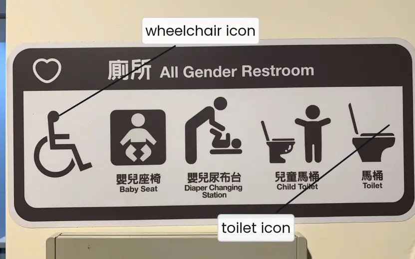
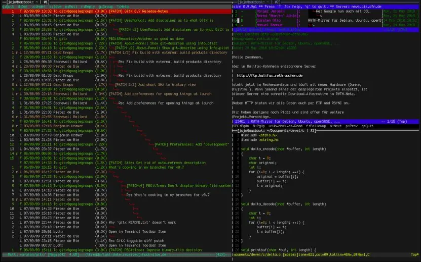
Plate 4.2 shows icons used on a real sign and tiled windows on a real screen.
The figures then draw the six menu types, the cost of deep menus, the anatomy of a window, the window styles, button states, a control chooser, icon construction, a correctly built form and the real size of the same photograph in different formats.





4.5.1 Eight rules for choosing and designing UI components in Nepal
- Use standard controls in the usual way. A checkbox must look and work like a checkbox, and a link like a link. Users bring habits from eSewa, Daraz and Gmail, and a strange control costs them time and trust. Use the platform's own components before building a custom one.
- Keep menus broad and shallow. Four to eight items per menu and two or three levels at most (Fig. 4.2). A Nepali government portal with menus six levels deep makes citizens quit before they find the service. Group items, name them with plain verbs and put the most used first.
- Label every control and every icon. A visible label beats a placeholder that disappears, and an icon with a label beats an icon alone (Plate 4.2a). A heart or a star may mean "like", "save" or "favourite" to different users. Labels also help screen readers and translation into Nepali.
- Show every state. A button needs default, hover, pressed, focused, disabled and loading states (Fig. 4.5). In a ConnectIPS or Fonepay payment, a loading state stops the user from tapping Pay twice. A disabled button should say why it is disabled.
- Match the control to the data. Use a switch for an instant on or off, radio buttons for one of two to seven, a searchable list for many options and a typed field for a birth date (Fig. 4.6, Fig. 4.8). A drop-down of 77 districts is slow to scroll, so let the user type "Kas" and pick Kaski. The right control removes a whole class of errors.
- Use dialogs sparingly and name the actions. A modal dialog blocks the work, so use it only for decisions that must be made now (Fig. 4.4d). Buttons should read Save, Don't save and Cancel instead of OK and Cancel, and the safe action should be the default. Non-urgent news belongs in a toast or an inline message.
- Make targets large and spaced. Buttons and tabs need at least 44 px or 48 dp and 8 dp between them (Fig. 3.3). The users of a Nepali bank app often work one-handed on a bus or in a market. Put the primary action in the thumb zone and the destructive one far away.
- Optimise images and graphics for weak networks. Resize the image to its displayed width, use WebP or compressed JPEG, set width and height, lazy-load and give alt text (Fig. 4.9). A 307 kB photo became 50 kB with no visible loss, which matters on a 3G link in a hill district. Keep text outside images so it can be read aloud and translated.
Formula and fact sheet
- Menus: 4–8 items, broad and shallow, ≤ 3 levels; group by function; order by convention/frequency/sequence; mixed case.
- Menu types: menu bar, pull-down, cascading, pop-up, tear-off, iconic.
- Window styles: tiled (no overlap), overlapping (desk), cascading (offset stack). Window types: primary, secondary, dialog (modal/modeless).
- Radio = one of few; check box = any of several; drop-down = one from many; switch = immediate on/off; slider = approximate value.
- Icons: familiar, simple, consistent, labelled, tested; four kinds — resemblance, exemplar, symbolic, arbitrary.
- Touch targets ≥ 44 px/48 dp; placeholder is not a label.
Chapter summary
- Menus let users recognise commands; format them consistently, keep them short and well grouped, and pick the type — bar, pull-down, cascading, pop-up, tear-off, iconic — by the task.
- Windows may be tiled, overlapping or cascading; primary, secondary windows and dialog boxes serve different roles; modal dialogs should be rare.
- Controls are operable, text-entry, selection or other; choosing the proper control for the task prevents errors and speeds use.
- Icons and images must be meaningful, consistent, accessible and technically optimised.
Practice
- Explain the formatting rules for menus: consistency, organisation, complexity and ordering.
- Describe six types of menus with one use each.
- Differentiate between tiled, overlapping and cascading windows.
- Differentiate between primary windows, secondary windows and dialog boxes; modal and modeless.
- Choose the proper control for:agender (3 options);bdistrict (77 options);csubscribe to newsletter;dvolume;edate of birth; (f) accept terms.
- Why is placeholder text not a substitute for a label?
- Compare radio buttons and check boxes.
- Design a login dialog: list controls, states and error handling.
- List the four kinds of icons with examples and five guidelines for good icons.
- Explain the technical guidelines for web images.
Answers and worked solutions
1. Consistent wording, order, placement and shortcuts; organise by task and users' mental model; keep complexity low (4–8 items per menu, 2–3 levels); order by convention, frequency, importance or sequence, never randomly; group related items with separators.
2. Menu bar (main commands), pull-down (one category), cascading (submenus), pop-up (context actions), tear-off (floating palette), iconic (toolbar, tab bar).
3. Tiled: windows side by side without overlap; overlapping: windows stacked like papers; cascading: overlapping windows offset diagonally so each title bar shows.
4. Primary window: the main application window; secondary: supporting window dependent on the primary; dialog box: focused short exchange. A modal dialog blocks the parent until closed; modeless lets the user continue.
5.(a) radio buttons (few exclusive options);(b) drop-down list with search/autocomplete (many);(c) check box (or switch);(d) slider;(e) typed fields or date picker with year/month dropdowns (typing is faster for far dates); (f) check box.
6. It disappears when typing begins (memory load), often has low contrast, is not reliably read by assistive technology, and is mistaken for a pre-filled value. Use a persistent visible label.
7. Radio buttons: exactly one of a few visible, mutually exclusive options; check boxes: independent on/off choices, any number.
8. Fields: username/email (text box, label), password (masked with show toggle), "Remember me" (check box), primary button Log in, link Forgot password?, link Create account. States: default, focus, error, disabled while submitting. Errors: inline beside the field, specific ("The password is wrong. 2 attempts left.") without revealing which field is wrong if security demands it; keep typed data.
9. Resemblance (printer), exemplar (knife and fork), symbolic (cracked glass), arbitrary (radiation sign). Guidelines: familiar, simple, consistent style, labelled, tested, accessible name.
10. Choose the format (WebP/AVIF/JPEG for photos, SVG/PNG for graphics), compress, serve responsive sizes, lazy-load, specify width and height, add alt text, keep text out of images, license properly.
Model answers for Unit 4
Q1. Explain the functions of menus and describe the six types of menu. How should a menu be formatted? (10 marks)
Introduction. A menu presents a list of options from which the user chooses, so the user can recognise a command instead of recalling it.
Menus navigate through the system, execute commands, select options such as toggles, and show the actions available in the current context.
Types of menu (Fig. 4.1).
- Menu bar. A horizontal strip of titles (File, Edit, View) at the top of a window. It is always visible and follows convention, and the top screen edge is easy to hit (Fitts's law).
- Pull-down (drop-down). A list that drops from a menu-bar title; it closes after a choice and supports keyboard mnemonics such as Alt-F.
- Cascading (hierarchical). A submenu that opens beside an item marked with an arrow, such as Open Recent. Limit it to two levels and allow a short delay before closing.
- Pop-up (context). Appears at the pointer on a right-click or long-press and offers actions for the selected object. It saves travel but is not discoverable, so important commands must also exist elsewhere.
- Tear-off. Can be dragged away to become a floating palette; it is now rare.
- Iconic. Items are icons, as on a toolbar, ribbon or phone tab bar; add labels or tooltips for unfamiliar icons.
Formatting guidelines.
| Aspect | Guideline |
|---|---|
| Consistency | same wording, order, location and shortcuts everywhere |
| Presentation | mixed-case text; grey out unavailable items; arrow for submenu; tick for current choice |
| Organisation | by task or user workflow, found by card sorting |
| Complexity | broad and shallow: 4 to 8 items, 2 to 3 levels |
| Ordering | by convention, frequency, importance, sequence or alphabet; never random |
| Grouping | 3 to 5 items per group, separated by lines or space |
| Naming | short verbs, the same word for the same thing |
Modern patterns. The hamburger menu saves space but hides options and reduces their use; the tab bar shows three to five destinations; the kebab menu holds extra actions, with Delete last and separated.
Conclusion. A good menu is predictable, short and grouped by the user's mental model, and it keeps dangerous actions away from the frequent ones.
Q2. Why are broad, shallow menus better than narrow, deep ones? Illustrate with a calculation for 64 items. (5 marks)
Every level of a menu costs the user time to read the options, decide and move, and each level gives another chance to choose the wrong branch or to get lost.
By Hick's law, the decision time at one level is T = b log2(n + 1), which grows slowly with n, so a larger number of items per level is cheap compared with an extra level.
Calculation (Fig. 4.2). Take b = 0.2 s and assume 0.3 s per level for moving and reading. To reach one of 64 items:
| Layout | Time per level | Total |
|---|---|---|
| 1 level of 64 | 0.2 x log2 65 + 0.3 = 1.50 s | 1.50 s |
| 2 levels of 8 | 0.2 x log2 9 + 0.3 = 0.93 s | 1.87 s |
| 3 levels of 4 | 0.2 x log2 5 + 0.3 = 0.76 s | 2.29 s |
| 6 levels of 2 | 0.2 x log2 3 + 0.3 = 0.62 s | 3.70 s |
The deepest menu is almost 2.5 times slower than the flat one. A flat list of 64 must be scanned by eye, so the practical compromise is two levels of about eight items, grouped by meaning. This is why menus use 4 to 8 items per menu and two or three levels at most.
Q3. Describe the components of a window, the window presentation styles and the types of window. (10 marks)
Introduction. A window is a separate, bounded area of the screen that shows one view of the content. Windows let the user keep several tasks in view and switch between them.
Components (Fig. 4.3). The title bar shows the name, acts as the drag handle and carries the minimise, maximise and close buttons. Below it come the menu bar and the toolbar of frequent commands.
The client (work) area holds the content, with scroll bars when it is larger than the window. The status bar gives feedback, and the resize handle and frame let the user change the size. Tabs may hold several views in one window.
Presentation styles (Fig. 4.4).
| Style | Idea | Pros | Cons |
|---|---|---|---|
| Tiled | windows edge to edge, no overlap | all visible, no lost windows | each window is small; resizing one changes others |
| Overlapping | windows lie over each other like papers | familiar, large, flexible | windows hide each other, time spent arranging |
| Cascading | each new window offset down and right | automatic, all title bars show | top windows hide most of the others |
Other styles are split panes, tabs, virtual desktops and picture-in-picture.
Types of window.
- Primary window: the main window of an application; closing it exits the application.
- Secondary window: supports the primary window with properties, palettes or help, and closes with it.
- Dialog box: a short exchange that asks for information, confirms an action or reports a message; it may be modal or modeless.
Example. A text editor is a primary window; its Find and Replace panel is a modeless secondary window; "Discard changes?" is a modal dialog.
Worked comparison. A student has a code editor, a browser and a terminal open. With tiled windows each gets a third of the screen and all three can be read at once, which suits a copy-and-test routine.
With overlapping windows each can be full size, but the browser hides the editor and the student must keep switching.
With cascading windows the three title bars stay visible, so one click brings back any window, although the top window covers most of the others.
Conclusion. Good window design gives a descriptive title, a consistent layout, visible controls and a close button that is never hidden. Overlapping windows suit general desktops; tiled windows suit users who want everything in view.
Q4. Differentiate between modal and modeless dialogs and list the rules for designing a good dialog. (5 marks)
A dialog box is a small window for a short, focused exchange. A modal dialog blocks the parent window until it is answered (Fig. 4.4d). A modeless dialog lets the user keep working in the parent.
| Point | Modal | Modeless |
|---|---|---|
| Parent window | blocked | usable |
| Use for | decisions needed now: "Discard unsaved changes?" | tools used while working: Find and Replace, palettes |
| Risk | interrupts and annoys if overused | may be forgotten or lose focus |
Design rules.
- A clear title and plain language; one main question only.
- Buttons that name the action: Save, Don't save and Cancel, not OK and Cancel.
- The safe action is the default; Escape cancels and Enter confirms.
- The primary button follows the platform rule (right on Windows).
- Never use a modal dialog for non-urgent information: use a toast, snackbar or inline message. On a phone, a bottom sheet replaces most dialogs.
Example. When a student closes an unsaved exam form, a modal dialog asks "Save your changes?" with Save as the default.
Q5. Classify screen-based controls and explain how to select the proper control for a task. Illustrate with a registration form. (10 marks)
Introduction. Controls (widgets) are the objects through which users give input and receive output. Choosing the right control makes a form faster and removes errors.
Classification.
| Group | Controls | Notes |
|---|---|---|
| Operable | button, toolbar, link, switch, floating action button, progress bar | a verb label; primary, secondary and tertiary levels; six states (Fig. 4.5) |
| Text entry and read-only | text box, text area, password field, labels | visible label above the field, input types for the right mobile keyboard, inline validation |
| Selection | radio buttons, check boxes, drop-down, list box, slider, date picker | choose by the number of options and by one or many |
| Other | tabs, accordions, tooltips, sliders, steppers | organise content or give hints |
Selecting the control (Fig. 4.6). A switch is for an on or off setting that applies at once. A single check box is for an agreement on submit. Radio buttons are for one choice among two to seven, with all options visible.
A drop-down suits eight to fifteen options and a searchable list suits more. Check boxes allow any number of choices. A date picker or typed fields enter a date, and a slider enters an approximate number.
Registration form (Fig. 4.8). Full name uses a text box with a visible label. Date of birth uses typed fields because a birth year is far away. Gender uses three radio buttons. District uses a searchable list of 77 entries.
Subjects use check boxes. SMS alerts use a switch. The form ends in one primary button, Submit form.
General principles. Use standard controls in the usual way, label every control, group related controls, align labels and fields, let the tab order follow the visual order, show disabled states, give feedback and describe errors beside the field with a fix. Keep forms short and single-column.
Common mistakes. Using a drop-down for two options hides a choice that could be seen; using radio buttons for 77 districts fills the screen; using a text box for a yes or no invites typing errors; and using a switch where the user must press Save confuses a setting that applies at once with one that does not.
Each mistake adds a tap or an error for thousands of users.
Conclusion. Pick the control from the data: the number of options, one or many, and whether the effect is immediate. A well-chosen control is faster to use and harder to misuse.
Q6. What is an icon? Describe the types of icon and the guidelines for designing icons. (5 marks)
An icon is a small pictorial symbol that represents an object or an action.
Rogers describes four types (Fig. 4.7): resemblance (looks like the object, a printer), exemplar (a typical example, a knife and fork for a restaurant), symbolic (a higher concept, a triangle with an exclamation mark for warning) and arbitrary (a learned convention, the Wi-Fi arcs).
Guidelines.
- Familiar: use standard icons: magnifier for search, bin for delete, gear for settings, envelope for mail.
- Simple: readable at 16 to 24 px, with no fine detail, one stroke width, one corner radius and one style (outlined or filled, not mixed), on a 24 x 24 grid with 2 px padding.
- Labelled: add text whenever the meaning is not universal (Plate 4.2a).
- Tested with users in a recognition test, and accessible, with an accessible name, enough contrast and size.
- Avoid culture-specific gestures and symbols of old technology, and use vector (SVG) files.
Example. A "heart" and a "star" can both mean favourite, so an app that uses both should add the words Like and Save.