Unit 8 · 36 min read
Advanced Techniques: VUI and NLP-based UI
What the syllabus asks for 7
- Voice and NLP-based interfaces
- Command and control versus conversational UI
- Personas, avatars, actors and video games
- Speech recognition technology
- Dialog management
- Designing for wearable devices
- Seeing the ideas: voices, speech, dialogs, characters and wearables
Not every interface has a screen. Voice assistants, chatbots and smartwatches ask designers to think about conversation, sound and tiny glanceable displays.
This unit covers command-and-control versus conversational UI, personas, avatars and actors, speech recognition and dialog management, and designing for wearable devices.
- Voice user interfaces (VUI) and natural-language (NLP-based) UIs.
- Command-and-control versus conversational interaction.
- Personas, avatars, actors and video-game characters in interface design.
- Speech recognition technology and dialog management.
- Designing for wearable devices.
8.1 Voice and NLP-based interfaces
A voice user interface (VUI) lets people interact by speaking and listening (smart speakers, phone assistants, in-car systems, IVR phone menus).
An NLP-based UI (natural language processing) lets people use ordinary language — by speech or text — which the system parses and interprets: chatbots, search assistants, LLM-based assistants.
Why use them: hands-free and eyes-free (driving, cooking), accessibility (blind, motor-impaired, low-literacy users — including voice for people who cannot type in Nepali), speed for some tasks ("set a timer for ten minutes"), natural and low learning curve, and use on devices without screens.
Challenges: no visible options (discoverability — users do not know what they can say); speech is linear and slow to listen to (you cannot scan a spoken list), recognition errors (accents, noise, Nepali dialects, code-switching between Nepali and English), ambiguity, privacy (speaking aloud in public, always-listening microphones), memory load (users must remember what was said), no visual feedback, and the "uncanny" expectations created by human-like voices.
VUI vs GUI
| GUI | VUI | |
|---|---|---|
| Output | visual, persistent, scannable | audio, transient, serial |
| Input | pointing, typing | speech |
| Discoverability | menus and buttons show what is possible | invisible; must be taught (prompts, examples) |
| Error type | wrong click | misrecognition, misunderstanding |
| Information density | high | low — keep prompts short |
| Best for | complex, visual, comparison tasks | simple, quick, hands-free tasks |
| Privacy | screen shows data privately | speaks data aloud |
Many products are multimodal (voice + screen + touch): the assistant answers aloud and shows a card.
8.2 Command and control versus conversational UI
| Command-and-control | Conversational UI | |
|---|---|---|
| Interaction | the user speaks fixed commands from a limited vocabulary and the system executes ("Call Ram", "Volume up") | the user speaks or writes naturally, in sentences, and the system holds a dialogue across several turns |
| Understanding | keyword/grammar matching | natural-language understanding: intent and entities (slots) |
| Context | one-shot; no memory | keeps context: "Book a bus to Pokhara." "For tomorrow." "Make it two seats." |
| Flexibility | low; users must know the exact phrases | high; many ways to say the same thing |
| Reliability | high within vocabulary | lower; needs repair strategies |
| Learning curve | must memorise commands | none, but capabilities are not obvious |
| Examples | old voice dialling, car voice control, IVR "press or say 1" | Alexa, Google Assistant, customer-service chatbots, LLM assistants |
Choice: use command-and-control for a small, safety-critical, well-defined command set (hospital equipment, car functions); use conversational for open tasks and mixed expertise. Real systems mix them: a few reliable commands inside a conversational frame.
Natural language understanding in a conversational UI
- Utterance: what the user says. Intent: what they want (BookTicket, CheckBalance). Entities/slots: the parameters (destination = Pokhara, date = tomorrow, seats = 2).
- The system extracts intent and fills slots; if a required slot is missing, it asks ("What day would you like to travel?"); it confirms before irreversible actions.
- Ambiguity ("book it" — what?) and out-of-scope requests must be handled gracefully.
8.3 Personas, avatars, actors and video games
Here persona has a second meaning: the personality of the voice or character the system presents — name, tone, language style — distinct from the user personas of Unit 2.
System persona
Every voice or chat interface has a personality, whether designed or accidental.
Decide on it deliberately: who is the assistant? (a helpful bank clerk, a cheerful guide, a neutral tool); its tone (formal/friendly), vocabulary (Nepali honorifics — hajur, tapai — versus informal timi), humour, gender and voice, and consistency.
The persona must fit the brand and the context (a banking assistant should not joke about a failed payment), the users' culture and language, and should be honest about being a machine (no pretending to be human; disclose the bot).
Write a persona sheet (name, role, personality adjectives, do/don't phrases, sample dialogues) and use it as a style guide for all prompts.
Avatars
An avatar is a visual embodiment of the system or the user: an animated assistant character, a profile image, a 3D virtual agent.
Benefits: friendliness, attention, non-verbal feedback (nod, smile, "thinking" animation), engagement and trust, learning companions.
Risks: distraction, slowness, uncanny valley (nearly-human characters that feel eerie), stereotyping, and raising expectations the system cannot meet.
Guidelines: keep the avatar's capability matched to its realism (a simple cartoon for a simple bot), animate state (listening, thinking, speaking), allow it to be turned off, and design inclusively (diverse and culturally appropriate).
Actors (embodied agents) and video games
Actors are characters that act in a scripted or autonomous way: voice actors who record the prompts; embodied conversational agents such as a virtual shop assistant; non-player characters (NPCs) in games.
Video games are rich laboratories of interface design from which UX borrows: immediate feedback, clear goals, progressive difficulty and onboarding by doing (tutorial levels), reward loops, character voice and personality, heads-up displays that show status without clutter, diegetic interfaces (UI elements inside the game world), and flow (challenge matched to skill).
Applications: gamification (points, badges, streaks in a learning or fitness app — useful when it motivates real goals and harmful when manipulative), voice-acted tutorials, and characters as guides.
Design implications for conversational UIs: write dialogue like a script — read aloud, perform it with a colleague (table read), use Wizard-of-Oz tests; keep persona consistent across channels; use sound design (earcons) for status.
8.4 Speech recognition technology
Automatic speech recognition (ASR / speech-to-text) turns a sound wave into text. Speech synthesis (text-to-speech, TTS) does the reverse.
Pipeline of a speech recogniser
- Audio capture and sampling (typically 16 kHz).
- Pre-processing: noise reduction, echo cancellation, voice activity detection (where speech starts and ends).
- Feature extraction: the signal is cut into ~25 ms frames; MFCCs or spectrogram features are computed.
- Acoustic model: maps features to phonemes (earlier HMM-GMM; now deep neural networks: end-to-end models such as CTC, RNN-T, Whisper-style transformers).
- Pronunciation lexicon and language model: choose the word sequence that is most probable ("recognise speech" versus "wreck a nice beach").
- Decoder produces the transcript, often with confidence scores and alternatives (n-best list).
- NLU then derives intent and entities.
Measures and problems
Word error rate (WER) = (S + D + I) / N — substitutions + deletions + insertions over the number of reference words.
Example reference "set an alarm for six", output "set an alarm for sticks" → 1 substitution in 5 words → WER = 20 %.
Factors that raise errors: noise, accents and dialects, speaking style, vocabulary (names, domain terms), homophones, code-switching, low-resource languages (Nepali has far less training data than English — accuracy is lower and varies by region), overlapping speakers.
Types: speaker-dependent vs independent; isolated-word vs continuous; small vocabulary vs large vocabulary; on-device vs cloud recognition (privacy and latency vs accuracy); wake word detection ("Hey Google") runs locally and always listens for the trigger only.
Speaker recognition (voice biometrics) identifies who is speaking.
Speech synthesis and prompt design
TTS (concatenative → neural) must sound clear and natural; control speed, pitch, pauses with SSML markup.
Prompt guidelines: be brief (first-turn prompts under ~10 seconds), put the key information last (the end of a spoken sentence is remembered best), offer at most 3 options at a time, use everyday words, front-load the question ("Which city?
Pokhara, Chitwan or Butwal?"), avoid long menus, and use earcons (short sounds) for state changes.
8.5 Dialog management
A dialog manager controls the conversation: it keeps state (what has been said and what is still needed), decides the next action (ask a question, confirm, call a service, answer, hand off), and manages turn-taking. Core elements:
- Dialog state tracking: current intent, filled and missing slots, history, user profile.
- Dialog policy: rules or learned strategies deciding the next system action.
- Natural-language generation: the wording of the reply.
Dialog styles
| Style | Description |
|---|---|
| Directed (system-initiative, form-filling) | the system asks one question at a time ("Which city?") — reliable, easy, rigid |
| Mixed-initiative | the user can volunteer extra information ("A ticket to Pokhara tomorrow, two seats") and the system fills several slots at once |
| Open-ended / free | LLM-style, any topic; flexible but harder to control and to keep accurate |
Techniques: finite-state dialogs (flow charts), frame/slot-filling, rule-based, statistical/reinforcement-learning policies, and LLM-driven agents with tool use and guardrails.
Principles of good dialog design
| Principle | Practice |
|---|---|
| Grice's cooperative maxims | be truthful (quality), say enough but not too much (quantity), be relevant, be clear (manner) |
| Set expectations | greet, say what the system can do ("I can help you book a bus, check a booking, or cancel."), disclose that it is automated |
| Give users a way out | "agent", "help", "start over" always work; hand-off to a human with context |
| Confirmation | explicit ("Did you say Pokhara?") for high-risk, low-confidence steps; implicit ("Booking a bus to Pokhara. What date?") for low risk; avoid confirming everything |
| Error handling and repair | detect: no input, no match, low confidence; respond with escalating help: rephrase → give examples ("You can say tomorrow or a date") → offer another channel; never say only "I didn't understand" twice; limit to ~3 attempts then hand off |
| Context and memory | remember within the session ("it", "that one"), without being creepy; clear barge-in (the user interrupts the voice prompt) |
| Turn-taking and timing | respond within ~1 second; use filler sounds for long processing; do not cut off the user |
| Personality and politeness | consistent persona; polite but not verbose |
| Privacy and security | do not speak sensitive data aloud (PINs, balances) without authentication; confirm before payments; offer a visual channel |
| Discoverability | contextual hints, example phrases, "What can I say?" |
| Test with real users | collect real utterances, measure task completion, WER, intent accuracy, containment rate (resolved without a human) and user satisfaction |
System: "Namaste! I can book, check or cancel bus tickets.
What would you like to do?" User: "Ticket Pokhara kal." (Nepali–English mix) System: (intent BookTicket, destination = Pokhara, date = tomorrow: slots filled by mixed initiative) "Booking a bus to Pokhara for tomorrow.
How many seats?" User: "Dui." (two) System: "Two seats to Pokhara tomorrow, morning bus at 7:00 for NPR 1,200 each.
Shall I book it?" (explicit confirmation before payment) User: (noise, unrecognised) System: "Sorry, I didn't catch that. You can say yes or no." (repair with an example) User: "Yes." System: "Booked.
Your confirmation was sent by SMS." — each turn is short, key information last, one question at a time.
8.6 Designing for wearable devices
Wearables are computers worn on the body: smartwatches, fitness bands, smart glasses, earbuds (hearables), smart rings, health patches, AR/VR headsets.
Characteristics and constraints
- Tiny screens (a watch face ≈ 1.2–1.9 inches, some bands have none); little room for text and controls.
- Glanceable use: interactions of a few seconds; information must be understood in a glance (the "glance test": 2–5 seconds).
- Limited input: touch with a big finger on a small screen, crown/button, voice, gestures, tap-to-pay; text entry is slow.
- Limited battery and processing: use dark themes (OLED saves power), simple animation, offload to the phone.
- Always on the body: context-aware and sensor-driven (heart rate, steps, GPS, accelerometer) — proactive notifications at the right moment.
- Social acceptability: talking to or gesturing at a device in public; discreet haptic feedback (vibration patterns) is often better than sound.
- Privacy and health data: highly personal; clear consent, local processing, secure storage.
- Companion model: the watch and the phone divide work — the watch for glance and quick actions, the phone for setup and detail.
Design guidelines
| Guideline | Practice |
|---|---|
| Glanceable | show the single most important item; large type (≥ 16 pt), high contrast; one idea per screen |
| Minimal interaction | at most 1–2 taps for the main task; use complications/widgets and quick replies instead of typing; voice dictation for text |
| Large touch targets | min ~ 44 pt (watchOS) / 48 dp (Wear OS); keep targets away from the edge of round screens |
| Prioritise notifications | short, actionable, only what matters; let users control; haptics to attract attention; never spam the wrist |
| Context-awareness | use sensors to anticipate (show boarding pass at the airport, workout controls during a run); allow quick dismissal |
| Multimodal | combine haptic, visual and audio feedback; allow eyes-free use during sport |
| Respect the shape | round vs square screens, bezel and crown interaction; content centred and hierarchical |
| Battery-aware | black backgrounds on OLED, limited animation, reduce wake-ups |
| Accessibility | text size, VoiceOver/TalkBack, haptic cues, colour-blind safe palettes |
| Seamless handoff | continue on the phone for complex tasks ("Open on iPhone") |
| Safety | do not distract while driving or cycling; minimise glances |
Example: a Nepal bus-ticket watch app — shows the next departure ("Pokhara 7:00, Seat 12 — 25 min"), a single button Show QR, a haptic reminder 30 minutes before departure; everything else (changing the booking) is handed off to the phone.
For smart glasses/AR add: do not obstruct vision; use short bursts of information anchored in the world; voice and gaze input. For hearables: audio-only UI with earcons and voice; very short prompts.
8.7 Seeing the ideas: voices, speech, dialogs, characters and wearables
Voice and wearable interfaces take away the screen, the keyboard or both.
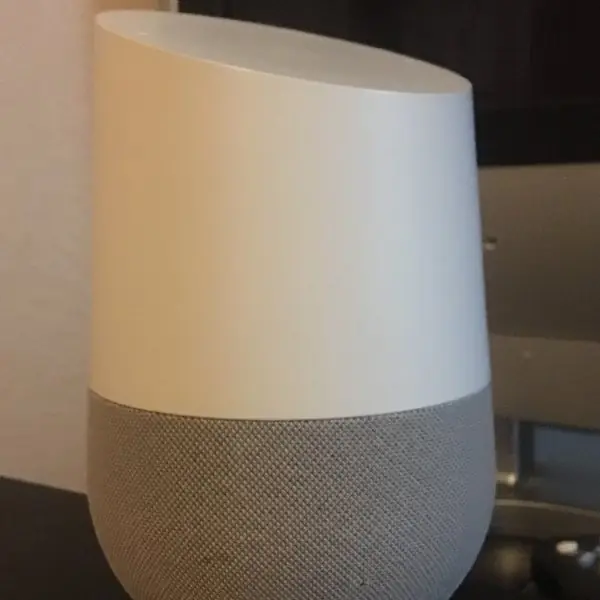
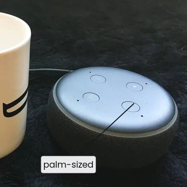
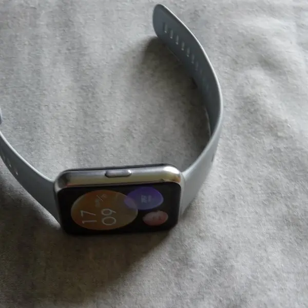
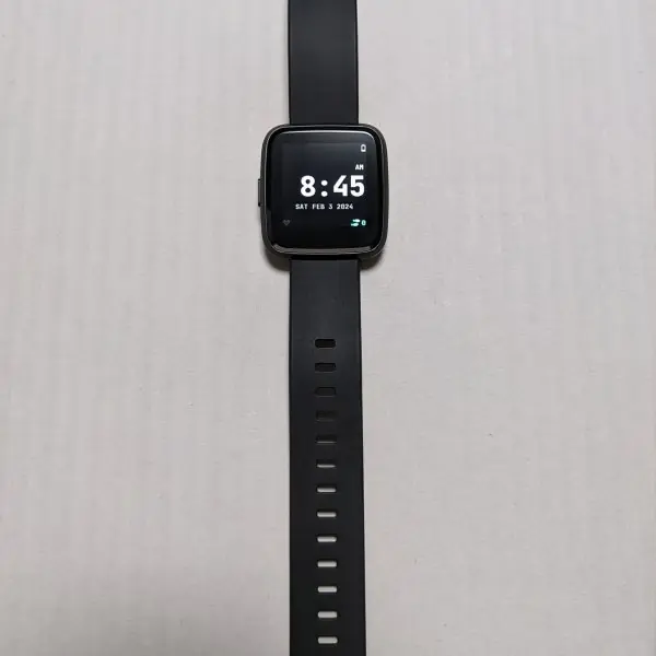
Plate 8.1 shows four real devices on that spectrum: a smart speaker with no screen at all, a puck-sized speaker next to a mug for scale, a smartwatch and a small open-source watch.
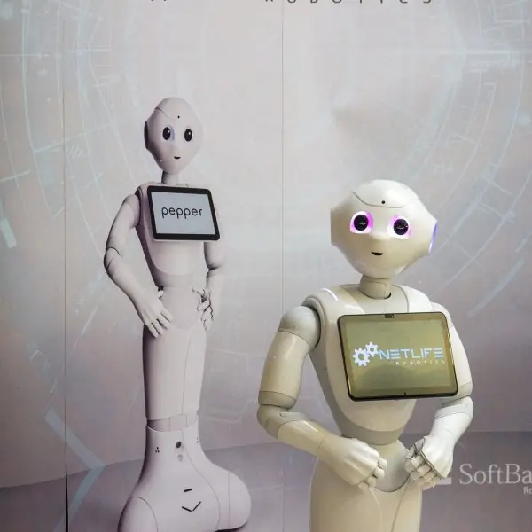
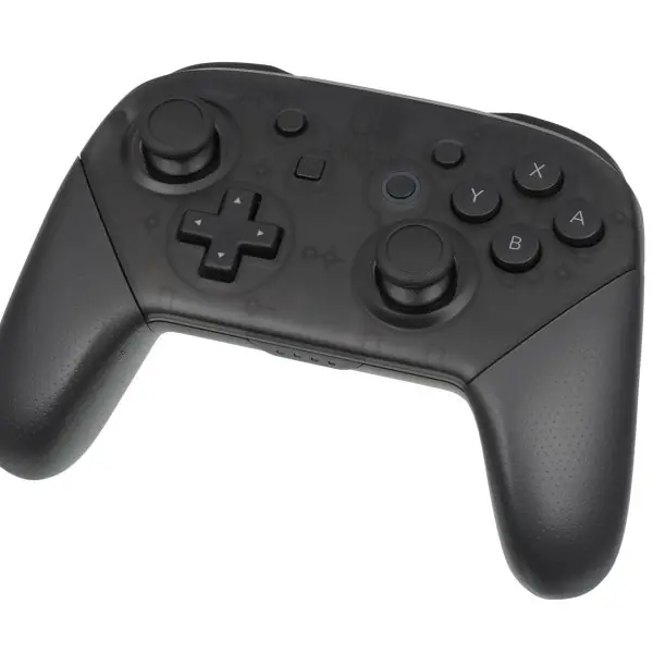
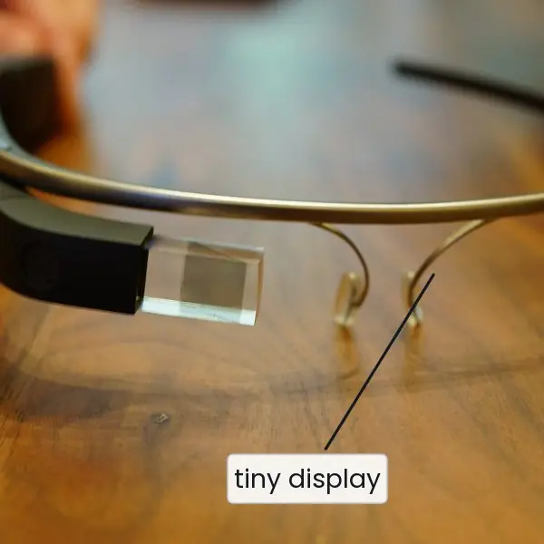
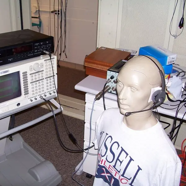
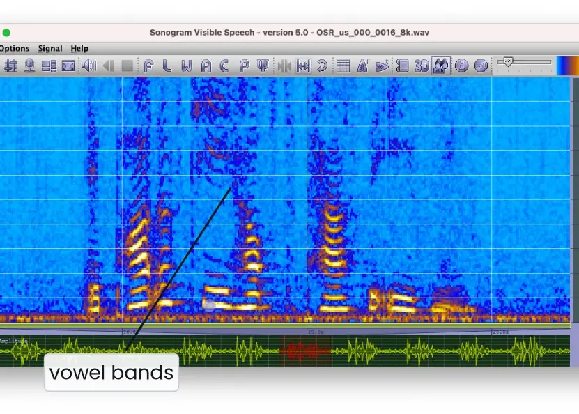
Plate 8.2 shows an embodied robot, a game controller, smart glasses and a headset on an audio test head. Plate 8.3 shows what a speech recogniser actually sees: a spectrogram.
The figures then compare spoken and visual output, parse an utterance into intent and slots, follow the recogniser pipeline, count word errors, draw a dialog as a state machine and an error-repair ladder, set a persona, compare screen sizes to scale and show the flow channel that games use.


8.7.1 Eight rules for voice, conversational and wearable interfaces in Nepal
- Support Nepali and code-switching. Many users mix Nepali and English in one sentence, such as "Pokhara ko ticket book gara". A recogniser trained only on English will fail them (Fig. 8.4). Test with real accents from different districts, and measure the word error rate for each group.
- Say what the system can do. A voice interface has no menu, so the first prompt must name the two or three things it can do. A bank line might say "I can check your balance, send money or block your card". Without this, users guess and fail (Fig. 8.1).
- Keep prompts short and put the key word last. Offer no more than three options and speak numbers slowly. A Nepal Telecom style balance reply should end with the amount, because the end of a sentence is remembered best. Long menus fail because speech is serial.
- Ask for missing information once, and confirm what costs money. Fill the slots from what the user already said (Fig. 8.2) and ask only for what is missing. Confirm explicitly before a payment, for example "Send Rs 500 to Sita through eSewa. Say yes to confirm" (Fig. 8.6). Do not confirm every small step, because that irritates people.
- Always give a way out. The words "agent", "help" and "start over" must work in every state (Fig. 8.5). After three failed tries, hand over to a human together with the context so the caller does not repeat everything. A farmer on a weak signal should never be trapped in a loop.
- Design the persona on purpose. Choose the name, the level of formality and the humour (Fig. 8.8). A bank assistant should use "tapai" and "hajur", while a study buddy for students may be friendlier. Keep the same persona on the phone, in the app and on the website.
- Protect privacy. A microphone that is always on (Plate 8.1b) must listen only for the wake word on the device, show clearly when it records and let the user delete the recordings. People speak personal numbers aloud in shared homes and buses. Offer a silent way to do the same task.
- Design wearables for glances. A watch screen is about nine times smaller than a phone (Fig. 8.7), so show one fact or one choice and use large targets. Use vibration for alerts and voice or the phone for long input. A step count, a bus arrival time or a fee-due reminder suits a watch, while filling an exam form does not.
Formula and fact sheet
- VUI: eyes-free and hands-free; weak discoverability; speech is serial → short prompts, ≤ 3 options, key information last.
- Command-and-control = fixed phrases; conversational = intents + slots + context across turns.
- System persona: deliberate name, tone and language; disclose that it is a bot. Avatars: match realism to capability (uncanny valley).
- ASR pipeline: audio → features → acoustic model → language model → decoder → text → NLU. WER = (S + D + I)/N.
- Dialog manager: state tracking + policy + generation. Mixed-initiative fills several slots at once. Confirm risky steps; repair with escalating help; hand off to a human after ~3 failures.
- Wearables: glanceable (2–5 s), 1–2 taps, haptics, sensors, phone companion, battery-aware, large targets.
Chapter summary
- VUI and NLP-based UIs give hands-free and natural interaction but hide their options and suffer from recognition and ambiguity errors.
- Command-and-control uses fixed commands and is reliable; conversational UIs use intents, slots and context and are flexible but less predictable.
- A designed persona gives a voice or chatbot a consistent personality; avatars and game-style characters can engage users when their realism matches their ability.
- Speech recognition converts speech to text through acoustic and language models; Nepali is a low-resource language with higher error rates.
- Dialog management tracks state, chooses the next action, confirms risk, and repairs errors with a human fallback.
- Wearables demand glanceable, minimal, context-aware, haptic-rich design.
Practice
- Compare VUI and GUI with advantages and limitations of each.
- Differentiate between command-and-control and conversational UI with examples.
- Define utterance, intent and entity; analyse "Book two seats to Pokhara for tomorrow".
- What is a system persona? Write a persona sheet for a bank's voice assistant in Nepal.
- What are avatars and the uncanny valley? List two design guidelines for avatars.
- How can video-game design inform UX? Give three techniques.
- Describe the pipeline of speech recognition. Compute the WER for reference "turn on the kitchen light", output "turn off the kitchen night".
- Explain dialog management, directed vs mixed-initiative dialog, and confirmation and repair strategies.
- List six guidelines for designing wearable interfaces.
- Design the interaction of a smartwatch app for medicine reminders (screens, notification, input).
Answers and worked solutions
1. VUI — hands-free, accessible, natural; but invisible options, errors, privacy. GUI — visible, scannable, precise; needs eyes and hands.
2. Command-and-control: fixed phrases ("Call Ram"); conversational: natural multi-turn dialogue with intent and context ("Book a bus to Pokhara" … "make it two seats").
3. Utterance = the sentence; intent = BookTicket; entities: seats = 2, destination = Pokhara, date = tomorrow.
4. The persona is the assistant's designed personality: name (e.g. "Dhan"), role (a calm, respectful bank clerk), tone (formal, uses tapai/hajur), do/don't phrases (no jokes about money problems), disclosure ("I'm the bank's virtual assistant"), sample dialogues.
5. An avatar is a visual embodiment of the system or user; the uncanny valley is the eeriness of nearly-human characters. Match realism to ability; show states (listening/thinking); allow disabling.
6. Immediate feedback; onboarding by playing tutorials; progress, rewards and badges (gamification); heads-up displays; flow.
7. Audio capture → pre-processing/voice detection → features (MFCC) → acoustic model → language model → decoder → text (→ NLU). Words: 5; "on→off" and "light→night" are 2 substitutions: WER = 2/5 = 40 %.
8. The dialog manager tracks state, chooses the next action and generates replies. Directed: one question at a time; mixed-initiative: user volunteers several slots. Confirm explicitly for risky or low-confidence steps; repair with rephrase → examples → alternative channel → human hand-off.
9. Glanceable content, minimal interaction, big targets, haptic and prioritised notifications, context-awareness, battery-awareness, accessibility, phone hand-off.
10. Notification: haptic tap plus "Paracetamol 500 mg — 8:00" with big buttons Taken and Snooze 10 min; main screen shows only the next dose; voice reply allowed; detailed schedule editing on the phone; missed-dose escalation to a caregiver after 30 minutes.
Model answers for Unit 8
Q1. What are voice and NLP-based user interfaces? Compare a VUI with a GUI and discuss the benefits and challenges. (10 marks)
Introduction. A voice user interface (VUI) lets people interact by speaking and listening, as with smart speakers, phone assistants, car systems and IVR phone menus (Plate 8.1).
An NLP-based interface accepts ordinary language, by speech or text, and the system parses and interprets it. Chatbots, search assistants and LLM-based assistants are examples.
Comparison with a GUI.
| Point | GUI | VUI |
|---|---|---|
| Output | visual, persistent, scannable | audio, transient, serial |
| Input | pointing and typing | speech |
| Discoverability | menus and buttons show what is possible | invisible, must be taught by prompts |
| Typical error | wrong click | misrecognition or misunderstanding |
| Information density | high | low, so prompts must be short (Fig. 8.1) |
| Best for | complex, visual, comparison tasks | simple, quick, hands-free tasks |
| Privacy | the screen shows data privately | data is spoken aloud |
Benefits.
- Hands-free and eyes-free use while driving, cooking or working.
- Accessibility for blind, motor-impaired and low-literacy users, including people who cannot type in Nepali.
- Speed for simple tasks such as "set a timer for ten minutes".
- Natural interaction with a low learning curve.
- Use on devices with no screen, such as speakers and car dashboards.
Challenges.
- Discoverability: users do not know what they can say.
- Serial output: a spoken list cannot be scanned and must be remembered.
- Recognition errors from noise, accents and Nepali-English code-switching (Fig. 8.4).
- Ambiguity of natural language.
- Privacy: speaking in public and always-listening microphones.
- Memory load: the user must keep earlier options in mind.
Multimodal design. Many products combine voice, screen and touch: the assistant speaks the short answer and shows a card with the detail. This uses voice for convenience and the screen for density.
Conclusion. A VUI suits short, hands-free tasks and a GUI suits complex, visual ones. The best systems let the user choose, and they teach the voice commands in the first prompt.
Q2. Differentiate command-and-control from conversational user interfaces. (5 marks)
A command-and-control interface accepts a fixed set of spoken commands ("Call Ram", "Volume up") and executes them. A conversational interface accepts natural sentences and holds a dialog over several turns.
| Point | Command-and-control | Conversational |
|---|---|---|
| Input | fixed phrases from a small vocabulary | free sentences, many ways to say one thing |
| Understanding | keyword or grammar matching | intent and slots (Fig. 8.2) |
| Context | none, one shot | remembers earlier turns: "For tomorrow." "Make it two seats." |
| Reliability | high inside the vocabulary | lower, needs repair strategies (Fig. 8.6) |
| Learning | user must memorise the commands | none needed, but abilities are not visible |
| Examples | car voice control, old voice dialling, "press or say 1" | Alexa, Google Assistant, chatbots, LLM assistants |
Choice. Use command-and-control for a small, safety-critical, well-defined set of commands, for example hospital equipment or car functions.
Use a conversational interface for open tasks and mixed expertise, such as booking a bus ticket. Real products mix the two: a few reliable commands inside a conversational frame.
In NLU, the utterance is what is said, the intent is what the user wants (BookTicket) and the slots are the parameters (destination, date, seats). A missing required slot is asked for, and an irreversible action is confirmed first.
Q3. Describe the pipeline of a speech recogniser and the problems that affect its accuracy. (10 marks)
Introduction. Automatic speech recognition (ASR) converts a sound wave to text, and speech synthesis (TTS) does the reverse. ASR is the front end of every voice interface, and its errors become the user's errors.
Pipeline (Fig. 8.3).
- Capture and sampling, typically at 16 kHz, so 16 000 numbers per second.
- Pre-processing: noise reduction, echo cancellation and voice-activity detection, which decides where speech starts and ends.
- Feature extraction: the signal is cut into 25 ms frames every 10 ms (400 samples, hop 160 samples, 98 frames per second), and features such as MFCCs or a spectrogram are computed for each frame (Plate 8.3).
- Acoustic model: maps the features to phoneme probabilities. Older systems used HMM-GMM; modern systems use deep neural networks and end-to-end models.
- Lexicon and language model: choose the most probable word sequence, so "recognise speech" beats "wreck a nice beach".
- Decoder: produces the transcript with a confidence score and alternative hypotheses.
- NLU: extracts the intent and slots from the text.
Measuring accuracy. Word error rate, WER = (S + D + I) / N, counts substitutions, deletions and insertions against the N words of the reference. For "set an alarm for six" recognised as "set an alarm for sticks", WER = 1 / 5 = 20 percent (Fig. 8.4).
Problems.
| Problem | Effect |
|---|---|
| Background noise and echo | more substitutions and missing words |
| Accents and dialects | models trained on other speakers fail |
| Code-switching Nepali and English | words fall outside one language model |
| Names and domain words | unseen words are replaced by common ones |
| Homophones | the wrong word with the right sound |
| Low-resource languages | little training data |
Types. Systems may be speaker-dependent or independent, isolated-word or continuous, small or large vocabulary, and on-device or cloud.
On-device recognition is private, fast and works offline; cloud recognition is usually more accurate. Wake-word detection runs locally and listens only for the trigger phrase. Speaker recognition identifies who is speaking.
Conclusion. Recognition is a chain of signal processing and probability, and every stage can fail. Designers must expect errors, measure WER on real users and build repair into the dialog.
Q4. Compute the word error rate for the reference "book two seats to pokhara tomorrow" and the output "book to seats pokhara tomorrow now". (5 marks)
Definition. WER = (S + D + I) / N, where S is substituted words, D is deleted words, I is inserted words and N is the number of words in the reference.
Alignment (the minimum number of edits that turns the output into the reference, Fig. 8.4):
| Reference | book | two | seats | to | pokhara | tomorrow | (none) |
|---|---|---|---|---|---|---|---|
| Output | book | to | seats | (none) | pokhara | tomorrow | now |
| Result | correct | S | correct | D | correct | correct | I |
Count. S = 1 ("two" became "to"), D = 1 (the word "to" was lost), I = 1 (the extra word "now"), and N = 6. So WER = (1 + 1 + 1) / 6 = 3 / 6 = 50 percent.
Interpretation. Half of the reference words need a correction, so this output would probably book the wrong trip. Notes. WER can be above 100 percent when there are many insertions.
A low WER does not guarantee that the meaning is correct, so intent accuracy should be measured as well. The error that matters most here is the lost number "two", which is a slot value, and that is why important slots are confirmed.
Q5. Explain dialog management. Describe the dialog styles and the principles of good dialog design. (10 marks)
Introduction. A dialog manager controls a conversation. It keeps the state (what has been said and what is still needed), chooses the next action (ask, confirm, call a service, answer, hand off) and manages turn-taking (Fig. 8.5).
Its parts are the dialog state tracker, the dialog policy and natural-language generation.
Dialog styles.
| Style | Description | Strength and weakness |
|---|---|---|
| Directed | the system asks one question at a time | reliable and simple, but slow and rigid |
| Mixed-initiative | the user may volunteer several facts at once | faster, needs better NLU |
| Open-ended | free, LLM-style conversation | flexible, harder to control and keep accurate |
Techniques include finite-state dialogs, frame and slot filling, rules, learned policies and LLM agents with tools and guardrails.
Principles of good dialog design.
- Grice's maxims: be truthful, give enough but not too much, be relevant and be clear.
- Set expectations: greet, say what the system can do and say that it is automated.
- Give a way out: "agent", "help" and "start over" work everywhere, and the hand-off to a human carries the context.
- Confirm by risk: explicit confirmation for costly or low-confidence steps, implicit confirmation for low-risk steps (Fig. 8.6).
- Repair errors: respond to no input, no match and low confidence with an escalating ladder: rephrase, give examples, offer another channel, hand off after about three tries.
- Use context: remember what was said so the user does not repeat it.
- Keep prompts short: key information last and at most three options.
Worked example. The bus assistant greets and lists its three abilities, accepts "Pokhara tomorrow, two seats" and fills three slots at once, asks only "Which time?", confirms "Two seats to Pokhara tomorrow at 7 am, say yes to pay" and then books.
Conclusion. Good dialog design combines a clear state machine with honest limits: the system says what it can do, asks only for what is missing, confirms what matters and hands over to a person before the user loses patience.
Q6. Explain system personas, avatars, actors and the lessons of video games for interface design. (5 marks)
System persona. Every voice or chat interface has a personality, whether planned or accidental.
It should be chosen on purpose: the name, tone (formal or friendly), vocabulary (the Nepali honorifics "tapai" and "hajur" against the informal "timi"), humour and voice (Fig. 8.8).
It must fit the brand and the context and stay the same on every channel. A bank assistant should be calm and brief, while a study buddy may be playful.
Avatars and actors. An avatar is a visual form of the system or the user: an animated assistant, a profile picture or a 3D agent. It adds friendliness, attention and non-verbal feedback such as a nod or a thinking animation.
The risks are distraction, slowness, the uncanny valley (almost-human faces that feel eerie) and raised expectations (Plate 8.2a).
Actors are voice actors who record prompts, embodied conversational agents and non-player characters in games.
Lessons from video games (Plate 8.2b). Games give immediate feedback, clear goals, onboarding by doing in tutorial levels, rising challenge that keeps players in the flow channel (Fig. 8.8) and rewards.
A learning app can borrow all of these. Practice. Write the dialog as a script, read it aloud in a table read, test it by Wizard of Oz and use short sounds (earcons) for status.
Q7. Explain the characteristics and constraints of wearable devices and give design guidelines for their interfaces. (10 marks)
Introduction. A wearable is a computing device worn on the body: a smartwatch, a fitness band, smart glasses or a hearing device (Plates 8.1c, 8.1d and 8.2c). It is worn all day, close to the body, and it is used in short moments.
Characteristics and constraints.
| Characteristic | Consequence for design |
|---|---|
| Tiny screen: a 1.4 inch watch has 1.54 square inches, a 6.1 inch phone 14.2 square inches (Fig. 8.7) | one fact or choice per screen, no long text or forms |
| Short, glanceable use, a few seconds at a time | show the answer immediately, no deep menus |
| Small battery | few animations, dark screens, sleep quickly |
| Limited input: tiny touch targets, no keyboard | voice, canned replies, crown or buttons, the phone for long input |
| Always on the body, with sensors | health and location data are very private |
| Used while moving or busy | large targets, haptics and sound as well as visuals |
| Needs a phone or cloud for heavy work | design for sync and for offline use |
Design guidelines.
- Glanceable: the most important information is visible in one look, with large numbers and icons.
- One task per screen, with a clear primary action and very little depth.
- Large touch targets and wide spacing, since fingers are bigger than the screen suggests.
- Use multiple channels: vibration, sound and voice, so that the user does not have to look.
- Move long input elsewhere: voice dictation, quick replies or the phone.
- Respect context and privacy: do not show private messages on a wrist in a crowd and ask permission for sensor data.
- Save battery and attention: send only useful notifications and let users set quiet hours.
- Test on the body, outdoors and while walking, not only on a desk.
Example for Nepal. A watch app for a city bus shows "Bus 23, 4 min" in large type and vibrates when the bus is near. It does not show the route list, which stays on the phone.
Conclusion. Wearable design is the art of leaving things out. By showing one thing at a glance, using several senses and leaving heavy input to other devices, a tiny interface can be quick, safe and respectful.